by Tiffany Nix • 3 minute read • February 19, 2014
I am no graphic designer. But I have some basic Photoshop skills under my belt, and I've learned a very important secret: you don't need to be a designer or a Photoshop whiz to create custom, one-of-a-kind images for your blog posts. Seriously, if I can do it, you can, too! It only requires one skill that I know you have—because we all do: the ability to trace. Take a look through the tutorial below and you'll see what I mean.
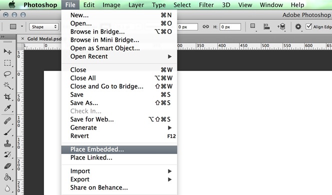
1. Open Photoshop and create a new document.
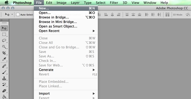
Open Photoshop, and start with File > New.
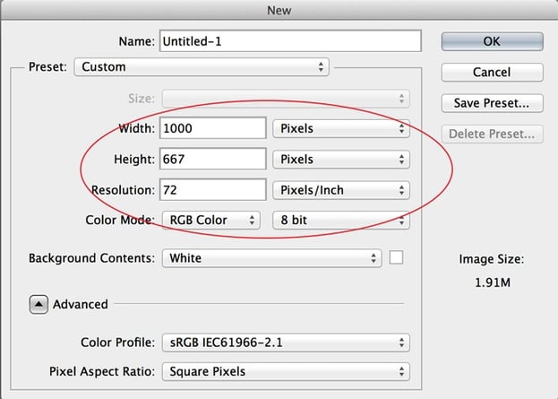
Then, concentrate on the items circled below. Figure out how large you'll need your blog image to be. Then, just for this original Photoshop file, choose a size that's at least double what you need. Your blog image space may only be 400 x 300 pixels, but that's a pretty small image. You never know when you'll want to use this image again, so make sure you choose a large enough size for your original file, so you'll be able to refer back to it in the future if you need to. My standard file size for these images are usually 1000 pixels wide by 667 pixels high. The resolution and color mode below are perfect for online images.
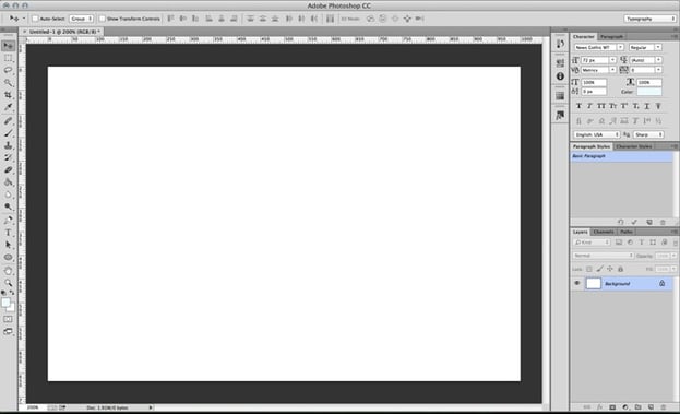
After you choose your size and press "OK," you'll have a fresh, blank canvas that looks like this. How exciting!
Don't forget to save your document starting right at the beginning!
2. Decide what you want your image to look like when it's finished, and find a photo online that's close to what you're wanting.
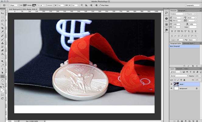
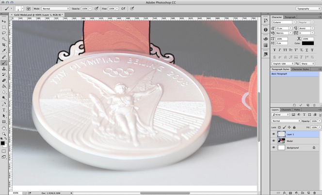
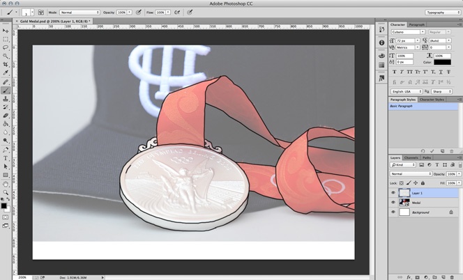
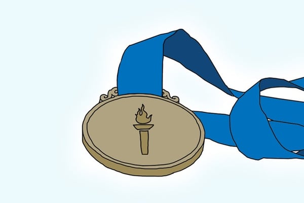
Like I said before, this is all about tracing. So, once you decide what you want your image to look like, simply go out there to the internet and find a photo that's similar to what you're picturing. You can search Google images, Flickr, or other image sites. The possibilities are endless! And as long as you're not replicating a logo or other copyrighted material exactly, you really can't go wrong. For example, for this particular blog post, I wanted an Olympic gold medal with a ribbon attached to it. So, I did a little searching and found this photo from UCI UC Irvine on Flickr. It's not a gold medal, and it has a hat in the background, but that doesn't matter, since I'll be choosing the elements and colors that I want to include in my final image. This photo is a great starting point for what I'm wanting.

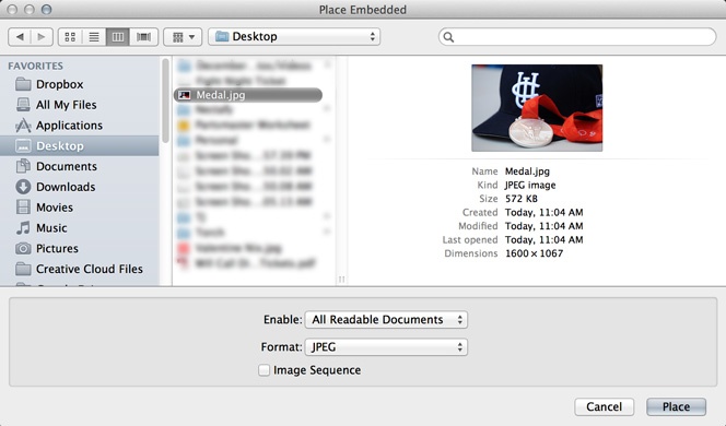
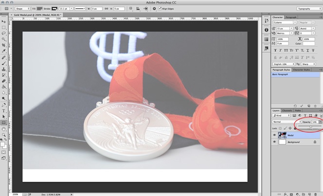
3. Place that photo into your new file. Then, lower its opacity.
Go to File >Place Embedded.
Choose your photo and "Place."
Press Enter/Return to finish placing. This places your image in a new layer. (You can see that the new layer is called "Medal" on the bottom right of the screenshot below.)
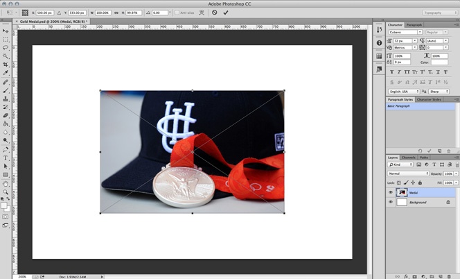
Once your image is in the file, resize the image to your liking (by selecting the layer, then pressing "Command + T" to select, and "Option + Shift" while you drag the edges in and out). Move it around and figure out how and where you want it. You can even rotate it if you're not satisfied with the angle of the original photo. Since I'm just wanting to trace the medal in my photo (not the hat), I resized it so the medal was large and centered within the canvas.
Then, lower the "Opacity" of your image. (See the screenshot below.) It doesn't need to be any specific percent—just fade it a little. This makes it easier to see what you're tracing later on.
4. Trace your heart out!
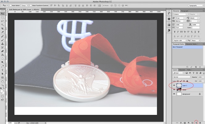
This is the fun part! Note: It's a lot easier if you have access to a tablet like this. And it's worth the small cost if you plan on doing this quite a bit. As shown on the screenshot below, click the small "Create a new layer" icon in the bottom of the "Layers" screen to get a new layer to trace in. It's so important to make sure that you're in this layer when you start tracing! If you accidentally trace in your image layer, you won't be able to "turn off" the image layer when you're finished tracing. Then all your efforts will have been wasted and you'll have to start over. (Wah wah.)
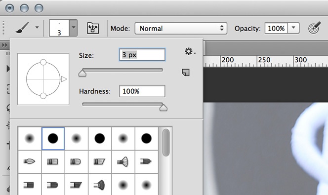
Click the Brush Tool icon in the menu. (Once again, make sure you're in your new layer.)

You can change your brush size to whatever you'd like by clicking this menu that pops up at the top of the screen (see below). (I normally choose between a 3 and a 5 for the outline trace.) I like to use the "Hard Round" tip highlighted below. This gives you a standard solid line that isn't dependent on the pressure of your mouse or pen tool, as some of the other options are.
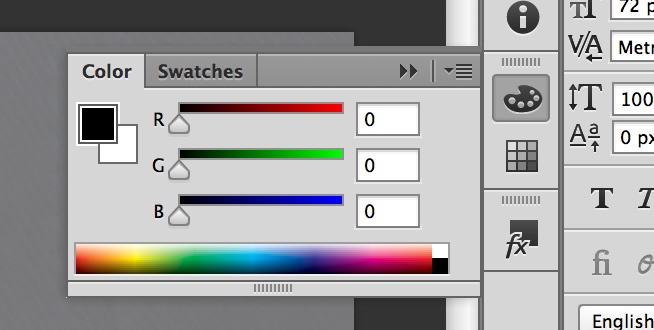
You can change the color of your brush by selecting Window > Color.
Now, you're ready to start tracing! Depending on the detailedness of the photo or image you chose, you can follow the lines loosely or more exactly, depending on what you'd like your end product to be. Remember, this will end up being "cartoon-y" or "sketch-y," so it doesn't have to be perfect. (I'm talking to you, you perfectionist!) Zoom in and out of your file as needed.
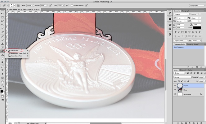
If you happen to mess up, you can either choose Edit > Step Backward, or use the Eraser Tool to erase only part of your previously drawn line.
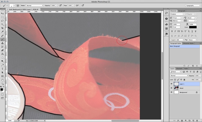
If you ever need a straight line and you're having trouble with it, try using this cheat: Place a dot where you want your line to begin...
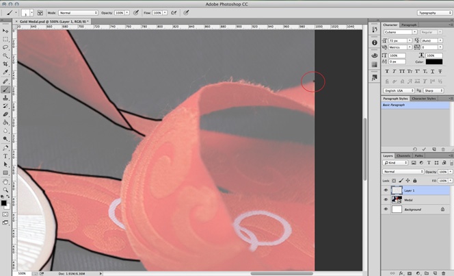
...then, move your cursor to the spot where you want your line to end, and while holding down "Shift," click to place another dot. Voila! Like magic, a nice straight line will appear.
While you're tracing, you may want to see how your image is looking without the photo in the background...
...in that case, just click the eye icon next to the image layer to check your progress. You can toggle back and forth by turning that eye icon on and off.
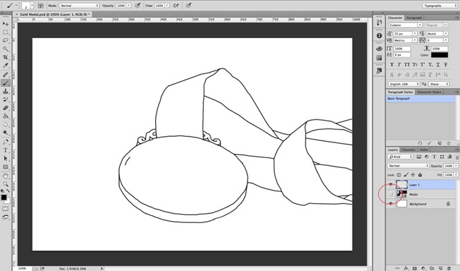
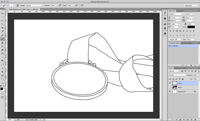
Before long, you'll be finished! Turn off that photo layer, and you'll have a nice outline of your image. Good job!
5. Add color to your image.
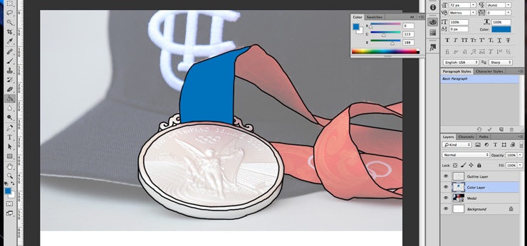
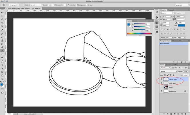
The is the fun part, too! You're in complete control of the colors of your image. First, duplicate the outline layer that you just completed by right-clicking the layer, then choosing "Duplicate Layer" and pressing "OK" on the menu that pops up. (I do this just to make sure I don't accidentally "ruin" the outline layer in any way.) I like to change the names of the layers just so it doesn't get confusing (see below). Make sure your outline layer is above your new color layer.
After you've made sure that you're working within the color layer, choose the Paint Bucket Tool in your main menu (as shown in the screenshot below). For my image, I decided that since my medal was going to be gold, I'd rather have a blue ribbon than red. So I found a blue color that I liked in the Color menu we chose from earlier, and starting filling in the areas of the color layer with the Paint Bucket Tool. If you notice that the Paint Bucket Tool doesn't fill your space all the way, just press "Shift" and click in the area again, and it will add a stroke around your first fill, filling the area more completely.
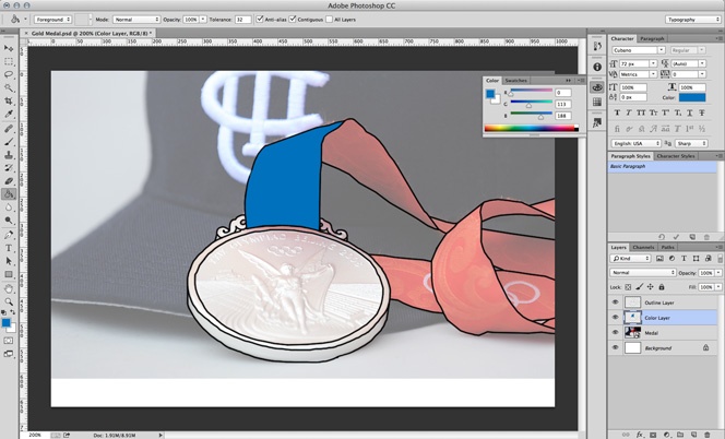
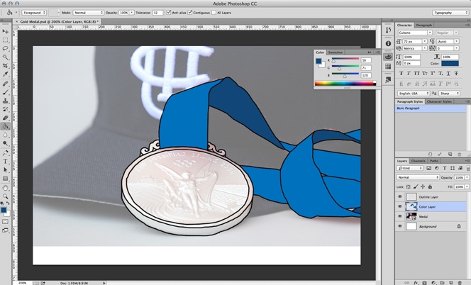
Even though I used blue for my ribbon instead of red, I can still use the photo as a guide to fill in my color. It helps me see where the shaded areas are. I chose a darker blue for those shaded areas, and in the end, that will make my image look a little more realistic.
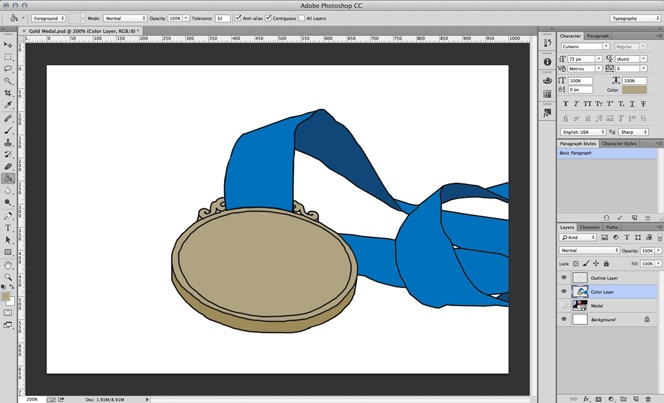
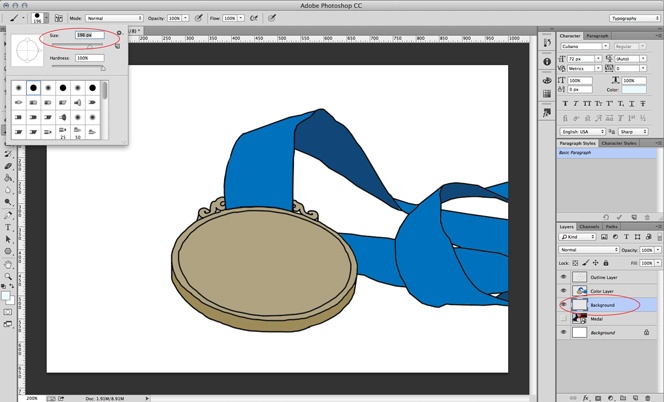
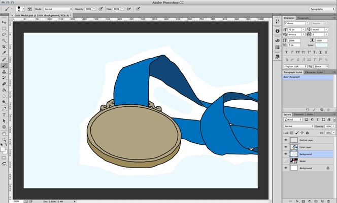
After you've finished coloring in your image, you may want to add a background color. There is already a "Background" layer present, so you can work within that layer if you'd like to. But since I still want some white to show through, I'm adding a new background layer to work within. For this particular background look, I chose my paintbrush tool, then changed the size to something fairly large.
Then, within that background layer, I added some color in the white areas.
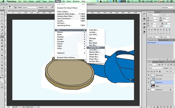
To blend that background in a little better, I chose to do a "Gaussian Blur" (see below).
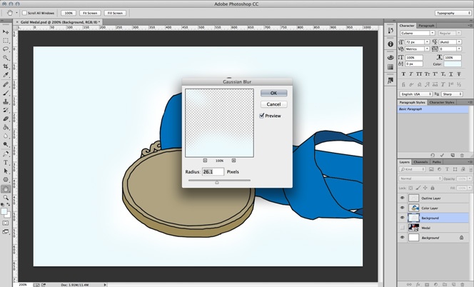
Then, I found a radius that I liked the look of, and clicked "OK."
And finally, I have a finished product! Well, actually, not quite yet...

6. Add finishing touches and save for the web.
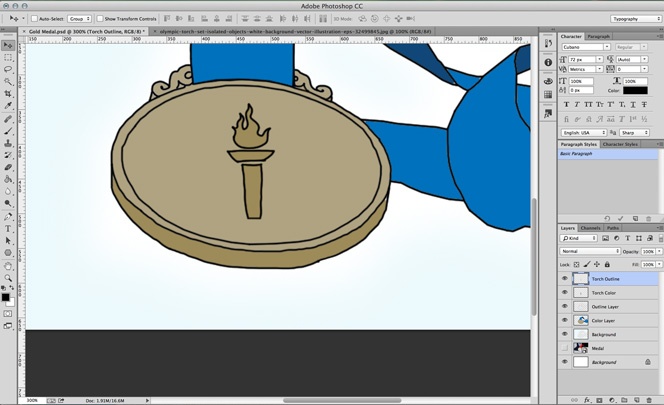
After looking at this finished medal, I started thinking that it was looking a little boring without a medal face. So I decided to add an Olympic torch. I did this by repeating steps 2-5 above. I found an image of a torch that I liked, placed it in my file, traced it, and colored it in. You can see the extra layers I added below.
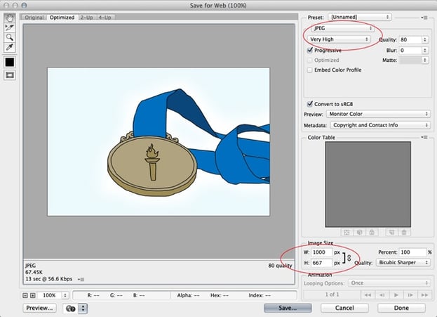
Now, you're ready to save your blog post image! Besides saving this original Photoshop file, you'll need to save a version of your image for your blog post. Start by choosing File > Save for Web.
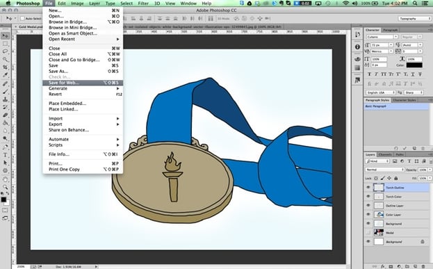
This "Save for Web" window will pop up. It has a lot of options, but you really only need to be worried about the ones circled below. Choose JPEG, and do a "High" or "Very High" quality—whichever looks good without it looking distorted or pixely. ("Maximum" will just make the file size too large.) Then, choose the largest, exact pixel dimensions that you know you'll need. (When you change the width, the height will automatically resize in proportion.)
And, you're finished! Congratulations!
The more you create these types of images, the quicker this process will become for you. And you'll have a blog full of custom images that your audience won't find anywhere else!
Have questions about this process? Leave me a comment below. I'll do my best to answer!