A 404 Error Page That Would Make Bono Smile


When you try to reach a page that doesn't exist on a website, you normally see a "404 - Page Not Found" error message.
You've seen that, right?
Let’s face it, when you get a 404 error page most of the time it means that someone on the website moved something and forgot to tell you. And, it's not cool. Don’t you deserve a little bit of recompense for your frustration and mental anguish?
Yes. I think so.
I'm on a one-man mission to make "messing up" acceptable. Or at least mildly amusing.
What you need to succeed in redesigning your website.
So, now on Nectafy, if you have the unfortunate experience of getting a 404 error page, instead of just seeing a boring little page, like this:

You’ll get to enjoy grand theatrics like this.
https://vimeo.com/85694907
(Proud papa note: hopefully that brought a smile to your face. It makes me smile, but that’s probably because I’m stinkin’ proud of my kids working so hard on their music.)
If that made you smile, even a little, would you share this page, share the video, or embed it on your own 404 page? Thanks, you’re swell.
So, what makes a 404 page memorable/helpful?
A Great 404 Page Includes These Components
1. Let your viewer know that something’s gone wrong.
The internet can be confusing at times, so if a page isn’t where it’s supposed to be, let your user know. And be nice. Remember it’s not their fault. (Most likely. Unless they just typed in a URL wrong. Even then, you need to be nice. Your mother would be proud.)
2. Dish up a touch of humor that takes the sting out of their disappointment.
I just made up this second point, mainly because I need a really good justification for putting so much work in on a video just for our 404 error page. But I will say that I’m not alone in trying to create a humorous moment on a 404 page. These guys have done some fun things, too.
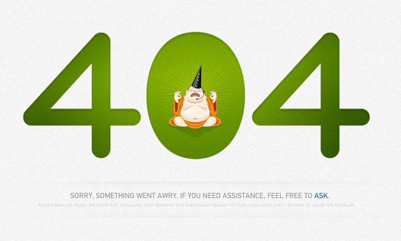
Zendesk. The subtle approach.
I love the small print. "In even smaller print, we offer our apologies that showing this overweight mascot of ours does absolutely nothing to solve the problem." Nice.
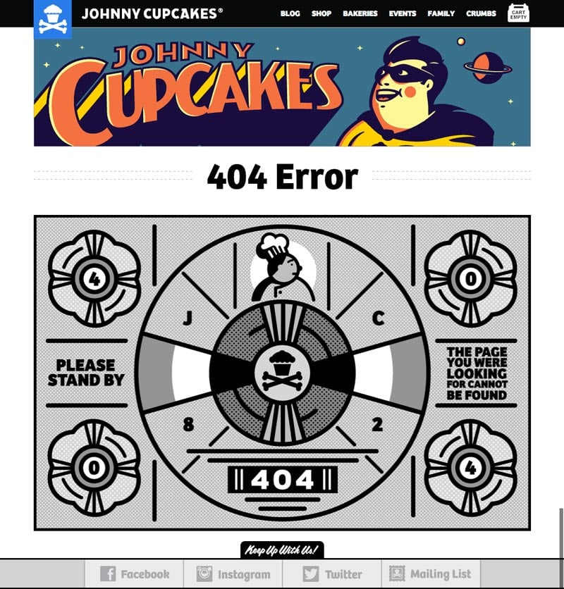
Johnny Cupcakes. It's all about the graphics.
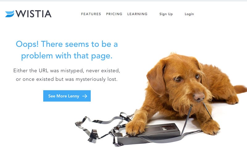
Wistia. Wait, they have a dog, too.
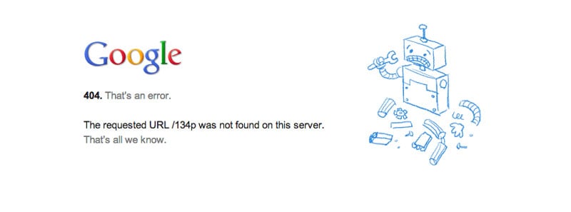
Google. So subtle I missed it.
Apple. Honestly, guys, you can design some sweet stuff, but where's the humor?
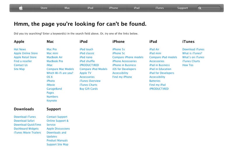
I was hopeful that Google and Apple would unleash their creatives on their 404 pages, but, alas, this is all you get. Where’s the love, people?
3. Provide a search box for them to try an internal search of your site.
At the least on your 404 page, you should give the user a way to find what they’re looking for. A search box serves that purpose very easily.
I think it's kind of funny that Google doesn't have a search box on their page. I mean, they are all about search, right?
Here's what we did with our page to display a search box.
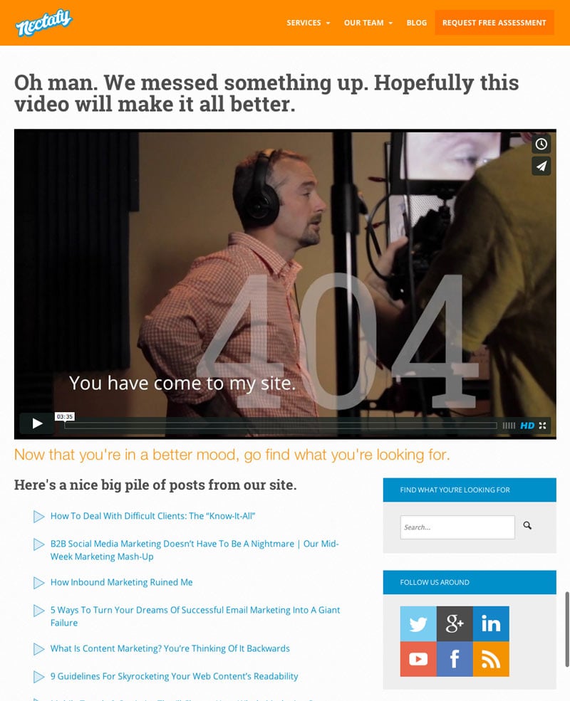
4. Provide a site map, or a list of links to help them get back on the road to happiness.
Give your hapless user some links to choose from to find something else on your site, before they hit the back button, never to be seen again. On our site, I decided to just list out a ton of posts from our blog, to give you an opportunity to find something interesting. I guess that's one thing Apple does right on their 404 page.
Ok, hopefully we've got your creative wheels turning. Share this post with your IT team and tell them to get you a creative 404 page. What are some other fun 404 pages you've seen?

