30 B2B Lead Generation Landing Page Examples (& How You Can Use Them Effectively)


.jpg)
A B2B landing page has a lot in common with a handshake: They both seem fairly straightforward, but there’s more going on than meets the eye. And depending on how well they’re executed, they could either seal a deal or sink it.
The best B2B landing pages are laser-focused on one thing—capturing lead information for your sales team to follow up on. Landing pages don’t need to make a sale, and they shouldn’t pretend to be your homepage. Too many of them try to do too much, which leads to confusion on the part of the customer. The end result is that your readers wander away, maybe to other parts of your website or maybe to other areas of cyberspace altogether, possibly never to return.
So how do you craft a B2B landing page that’s the equivalent of a job-getting handshake?
- Minimize links away from the page. Essentially, block the exit. When there’s only one way out, your visitors are less likely to stumble on an escape hatch and leave without giving you their number.
- Gather information in baby steps. It’s not always necessary to ask for every piece of information you’d like to have right off the bat. Sometimes micro-commitments are a good strategy if you have the ability to easily analyze how each step converts. You can ask for a low-friction piece of information first (like an email address, name, or title), which leads to another form with “just two more pieces of information and we can get your free trial going!” Do some testing to determine if this strategy is, in fact, working for you.
- Make the benefit of your product/service clear and tailored to the persona. Now is not the time to list the endless benefits of your offering. Whatever is most important to your persona, say it loud and clear.
All these elements come together to create a B2B landing page that builds trust and confidence. You’ve invited readers in, made sure they feel welcome, and they’re convinced you knew they were coming. It’s a pretty straightforward path from there.
All the above is usually easier said than done. That’s why we’ve gathered 30 B2B landing page examples to serve as inspiration. None of the examples we’ve chosen are perfect (is anything, really?), but they’re all valuable teaching tools. Since our goal is to help you craft the best B2B landing page possible, we’ve pointed out some things we’d change about each of them, which should give you some practical guidelines in addition to inspiration.
If, after taking a look through these examples, you’d like some help creating a B2B landing page template of your own—or anything else growth-content-related—drop us a line and we’d be happy to talk.
30 B2B Landing Page Examples You Can Learn From
1. Acquisio
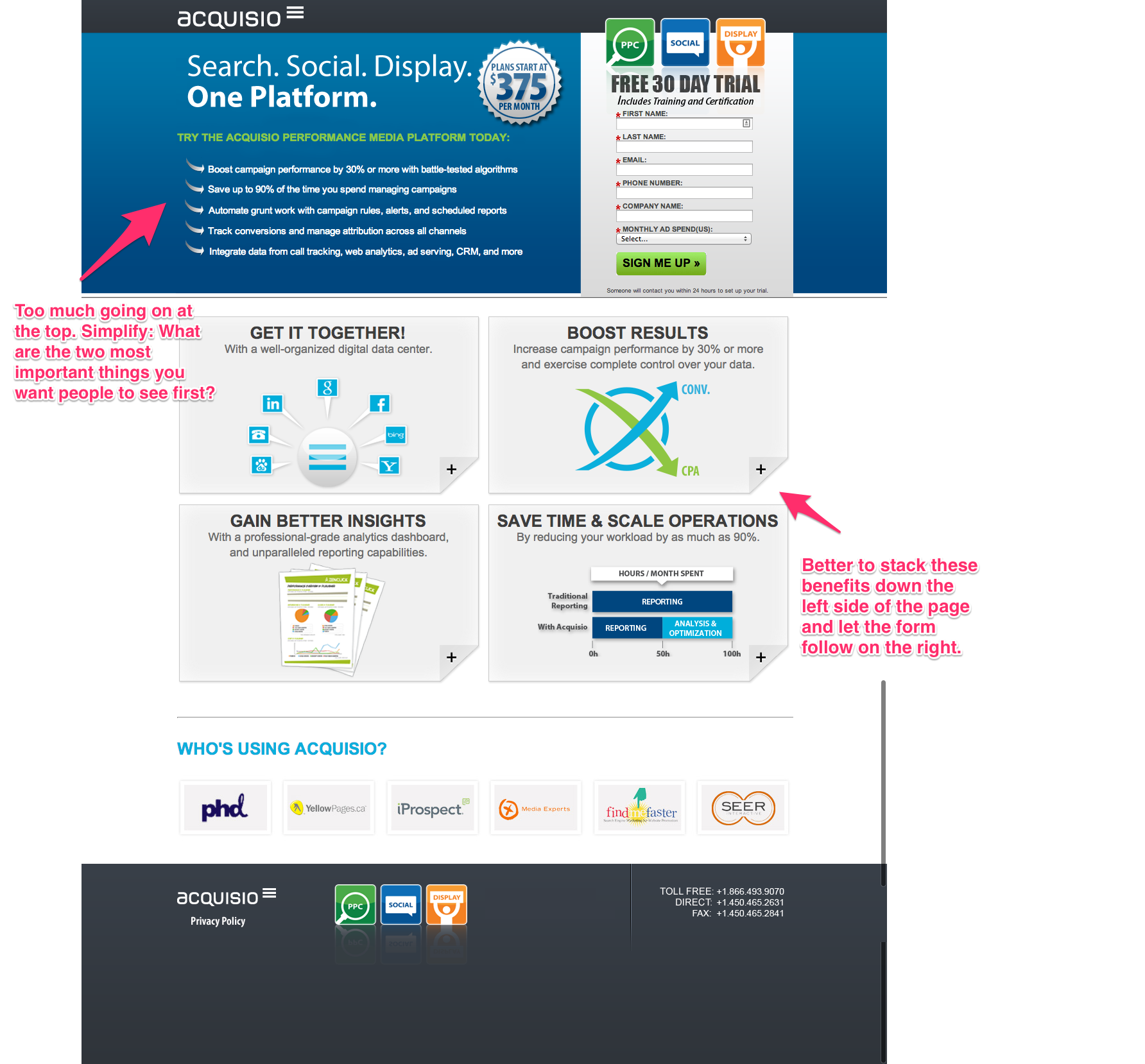
Overall this is an attractive page but it needs to be more focused. The four blocks in the middle are essentially repeating the bullet points. I’d remove all extraneous information and images from the top (bullet points and icons) and place the four boxes down the left side of the page and the form on the right.
Another point: The fine print under the signup form says someone will contact you within 48 hours. Even if that’s your usual process, avoid stating it here. Most people sign up online because they’d prefer not to talk to someone. Save the contact details for the thank-you email.
2. AdClarity
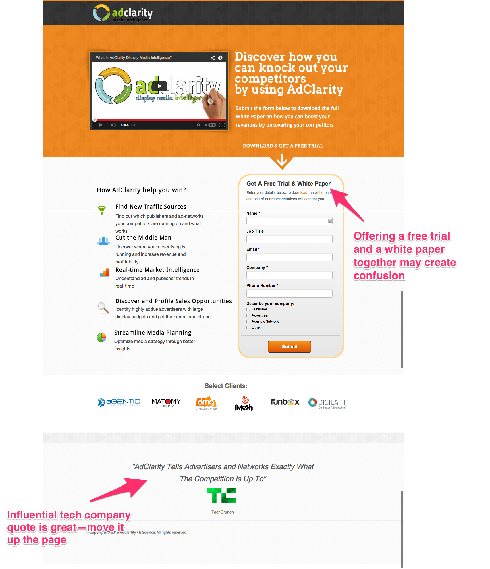
I like that the company name is prominently displayed at the top of the page (it’s important that people know they’ve come to the right place). Videos can be a good idea, but instead of YouTube, use a video hosting company like Wistia that gives you some analytics around views. You can also gate the video itself to get the information you need for the free trial—two paths are sometimes better than one.
Other fine points:
- This headline is clear and direct, but the subhead should be stronger to match.
- Don’t waste valuable real estate by asking people to “submit the form.” (And while we’re at it, who really wants to “submit” to anything?)
- Finally, while bundling two free items together is sometimes a good strategy when the items are very similar, if they’re not, it can create confusion, i.e. “Here’s a free car and a mug!” Give the white paper its own landing page, or use it for an exit-intent popup.
Need a guide to creating the white papers behind your landing pages? Download our free white paper checklist to ensure you’ve covered all your bases during the creation stage.
Helpful tip:
Another good tactic for a B2B landing page is an exit-intent pop up. When your visitor is just about to leave the page, present them with one final message offering a content download or other free resource to hold their interest—albeit in a different way. Some might find them annoying, but data shows they actually work: 10 to 15 percent of lost visitors can usually be recovered using this tactic.
3. AppDynamics
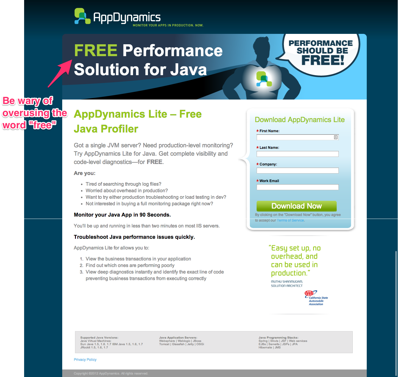
This page has a nice flow. The slogan provides clarification without being confusing. From there it identifies a need with the “Are you” questions, which speak to the persona directly followed by a solution that tries to get readers to convert. To some it may not be the most exciting layout, but it makes sense.
One caveat: Be careful about overusing the word “free.” Sure, it has some psychological appeal, and a single mention never hurt anyone. But more than one use may cause people to wonder if there’s a catch. This particular landing page throws “free” around pretty freely. (Plus, are they giving away free performance or a free performance monitoring and analytics solution?)
4. athenahealth
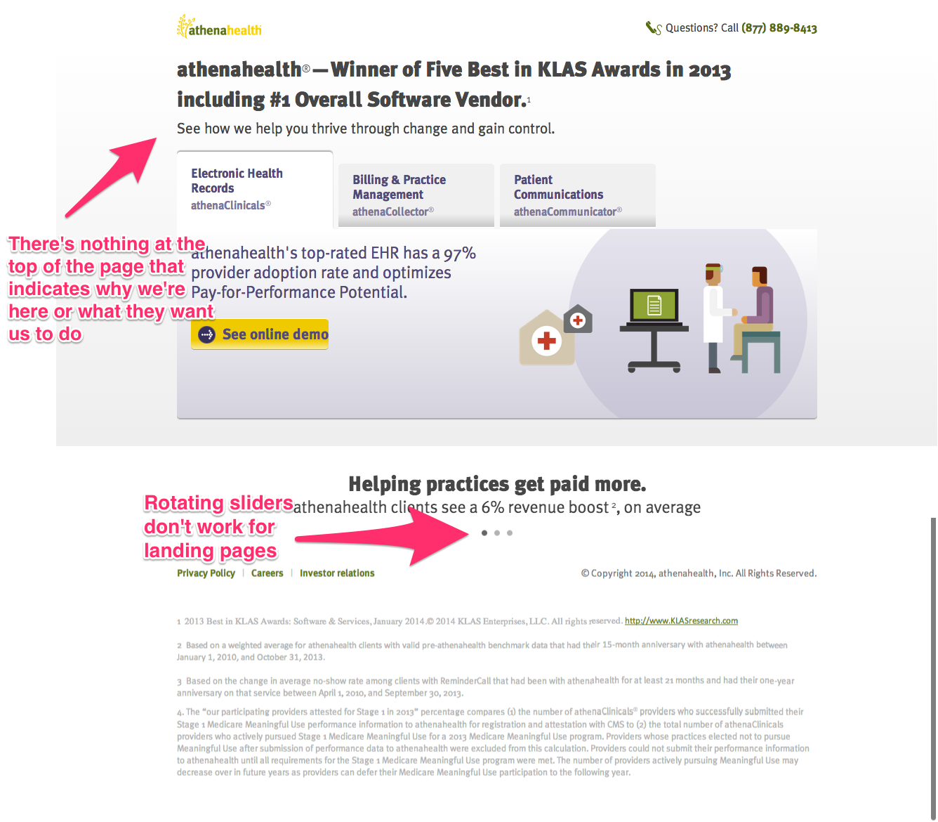
Let’s start with what like about the page: the logo/company name positioned at the top, and the linked telephone number for questions. If you have a customer service department willing to answer questions, this tactic is a good idea, particularly if you’re in a more traditional B2B field like healthcare, where most people probably do want to speak with someone.
But dedicating your landing page heading to a company award is the first symptom of a condition that afflicts the entire page: it’s company-centric. Instead, The copy should focus on the visitor—currently, it doesn’t help us to know, for instance, that they have a 97% provider adoption rate.
But the bigger issue is that it’s hard to know what we should do now that we’ve arrived. There are three tabs, all of which would have us do different things that seem to be equally important. Chances are good that most readers would leave this page because there’s no single clear action for us to take. In addition, the tabs themselves are rotating sliders, which makes it even more difficult for visitors to focus on any one thing.
5. Avangate
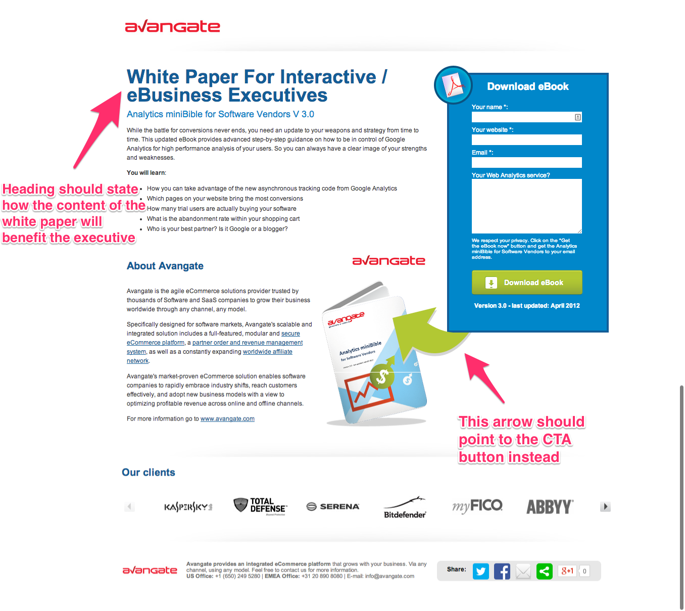
I like the overall structure of this page, and the “You will learn” bullet points tell readers exactly what they’ll get out of reading this white paper. (That’s if they get past the headline, which doesn’t tell us enough of anything to make us want to keep going.) The client logos at the bottom lend credibility and help build trust.
Other than changing the headline, I recommend removing the “About Avangate” paragraphs—at this stage, people aren’t interested in reading lengthy paragraphs about your company. Consider replacing it with a client testimonial or perhaps an award ribbon if there is one. Also, remove the “Share” buttons at the bottom of the page and the numerous links in the copy itself. All these components are likely to take visitors farther away from your desired action.
6. SoftActivity
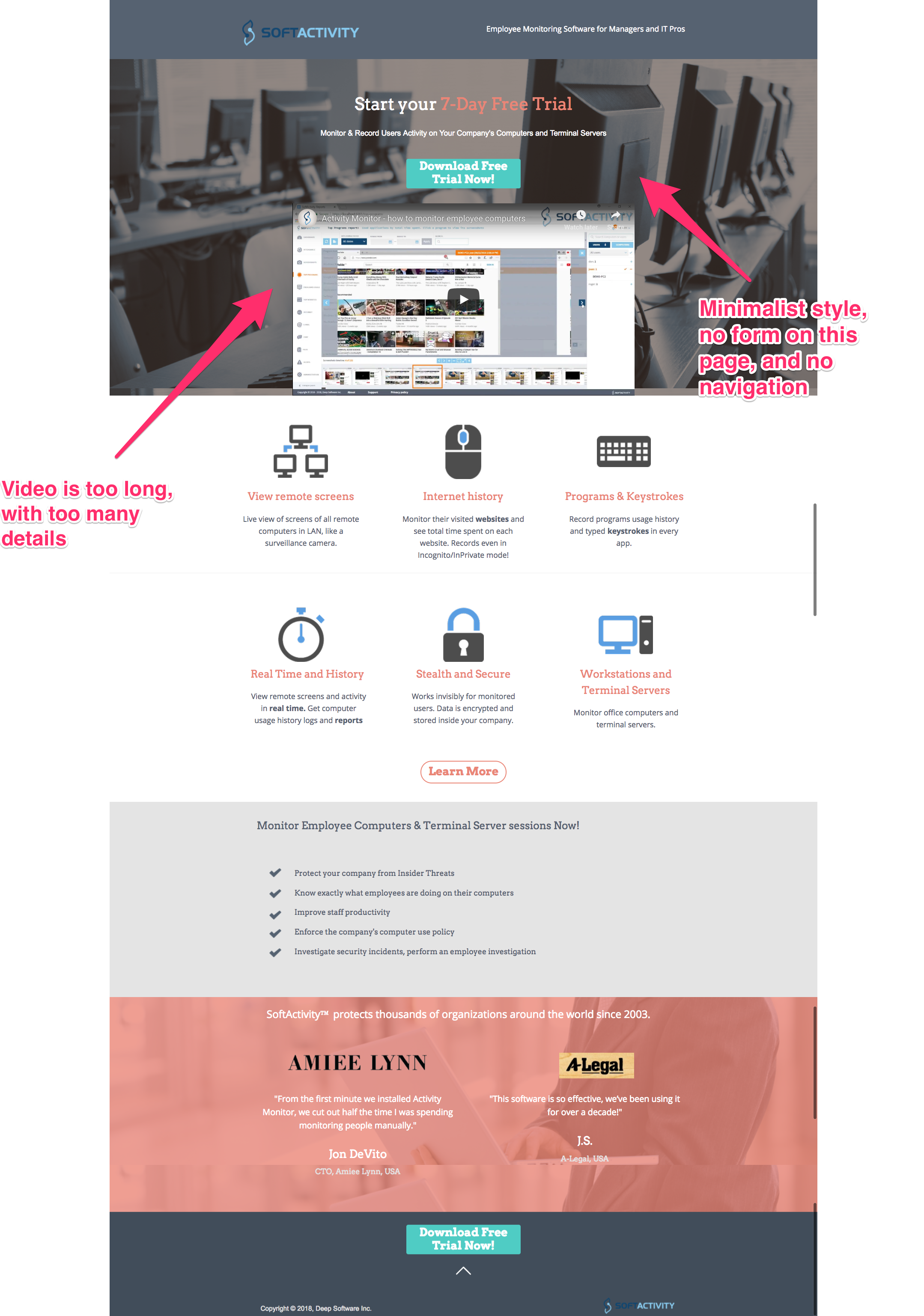
This page is nicely organized and clear. I like the minimalist style at the top, with just one button to click to get going which then takes you to a form. The software highlights and icons are well-designed and attractive, and the quotes are very persuasive. It’s also nice that it wraps up at the bottom with another simple reminder to download the free trial. Even the “Learn More” button in the middle leads to another page with free trial buttons, so we haven’t strayed far from the goal.
The only negative about this page is the video. It’s a good idea, but a bit lengthy (more than five minutes); it’s also not very engaging.
7. Jumpcrew
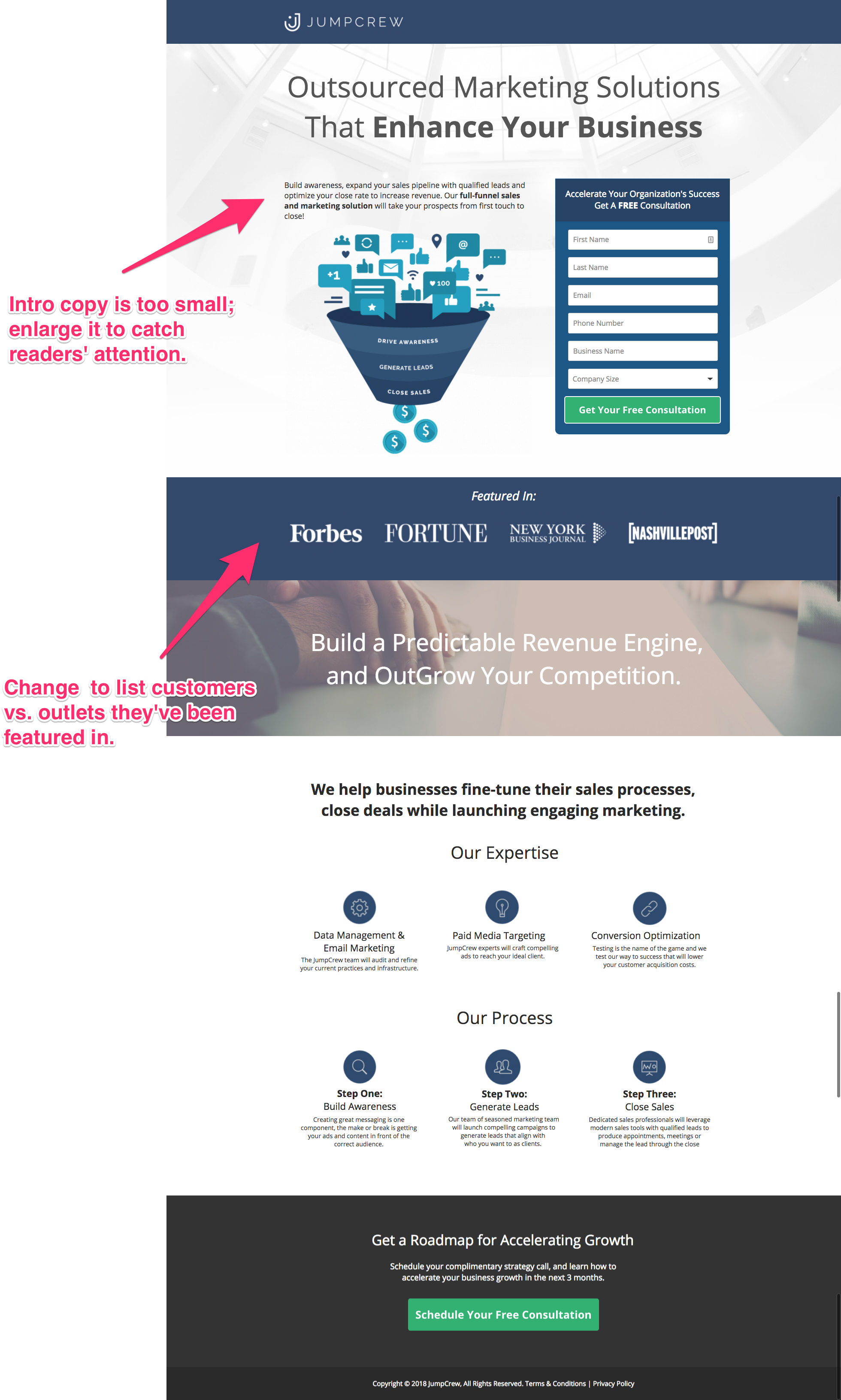
This landing page has a clear header, a great visual, and places the form above the fold, all of which contribute to a well-designed page. But there are a few things I would change about it.
The intro type is too small to garner real attention. And the “Featured In” media outlet names add some credibility, but they don’t have the same impact that customer names do. Finally, it would be great to see some of the information down below about how Jumpcrew can enhance your business higher up on the page, above the fold. That’s what would prompt someone to sign up—so make sure we see it right away.
8. Freshdesk
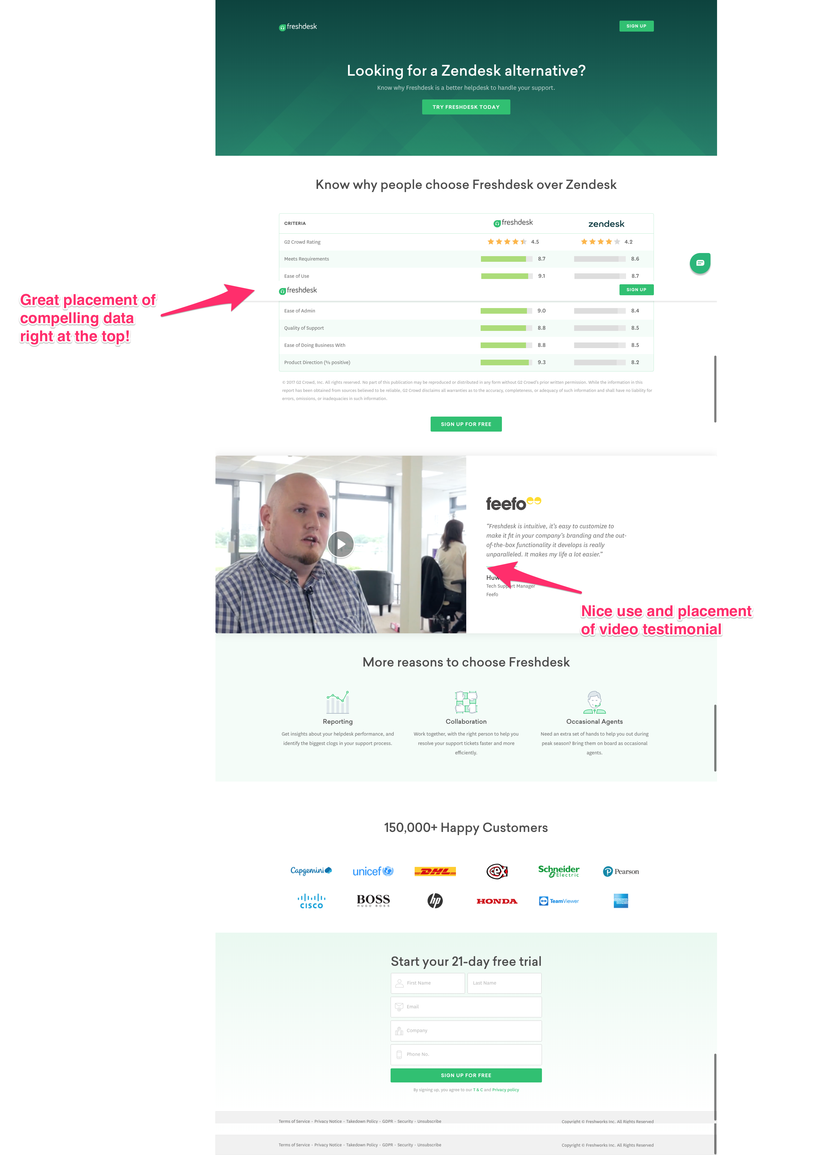
There’s not much I’d change about this one—it’s a strong landing page and a great design. The data at the top comparing Freshdesk to Zendesk—a top competitor—is compelling and very clearly presented. And the video is positioned in the right place, well-produced, and is under two minutes long. (But no way for us to action right within the video, though.) I also love the “150,000 Happy Customers” section. Nice work, Freshdesk.
9. Teamwork Projects
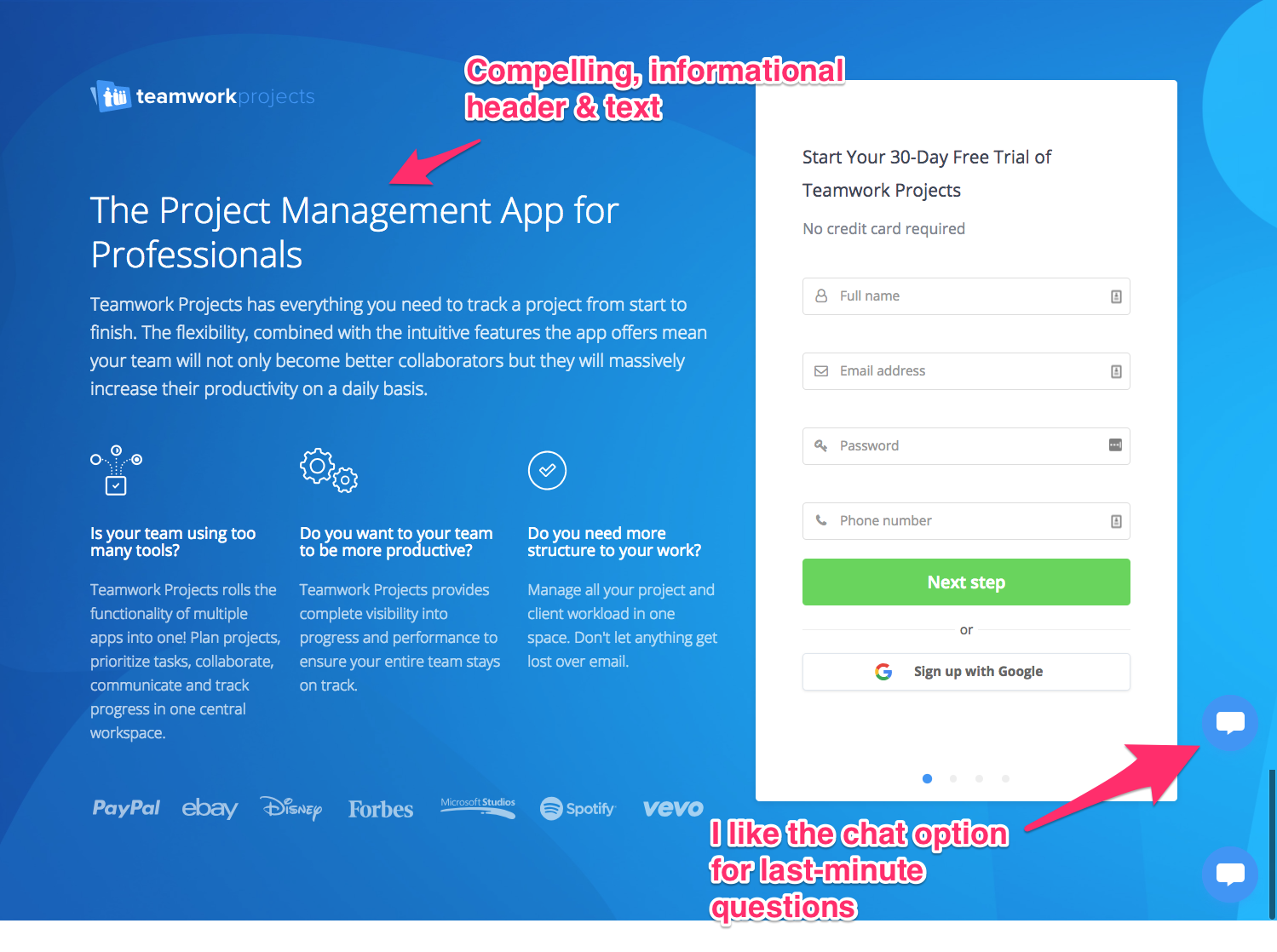
A little teamwork between designers and content creators and look what you get—a high-quality landing page. The form is large and attractive. I also like that their payment process doesn’t require a credit card and gives an option to sign up with Google. And as with a lot of B2B products and services, a chat option is a good call, because people might have a last-minute question about Teamwork Projects before signing up. I wouldn’t change a thing.
10. Evernote
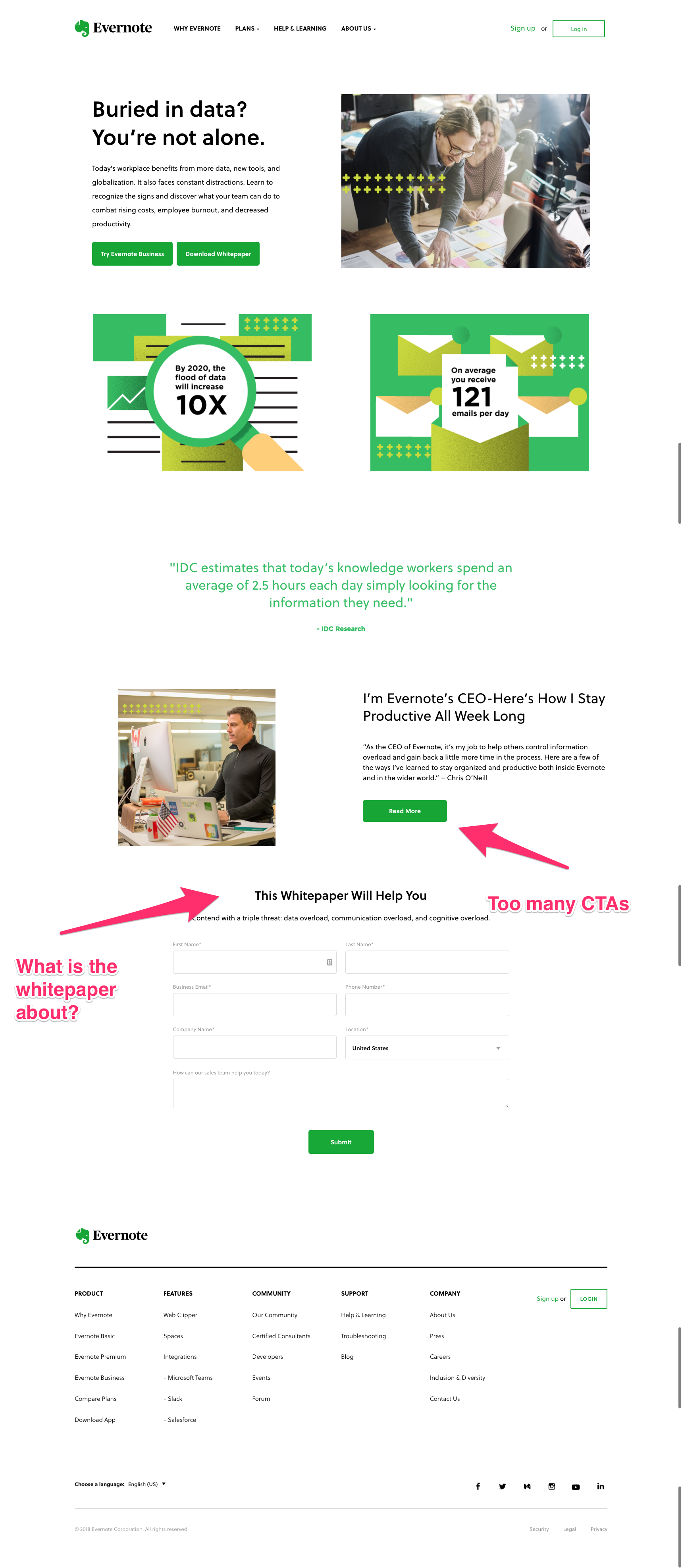
This page has an attractive design but falls short in the organization and content areas. “Learn to recognize the signs” of what? “Discover what your team can do to combat rising costs, employee burnout, and decreased productivity” is too general. I’m not sure at all what I would learn from downloading this whitepaper.
I’m also distracted by multiple CTAs. There are too many obstacles to the white paper download form at the bottom; if I decide to read the article by the CEO I’ve left the landing page. And the CTA next to the whitepaper download says “Try Evernote Business”—but there’s no copy to support it. (Incidentally, there’s another landing page for what appears to be the same resource that solves several of these problems.)
11. Mendix
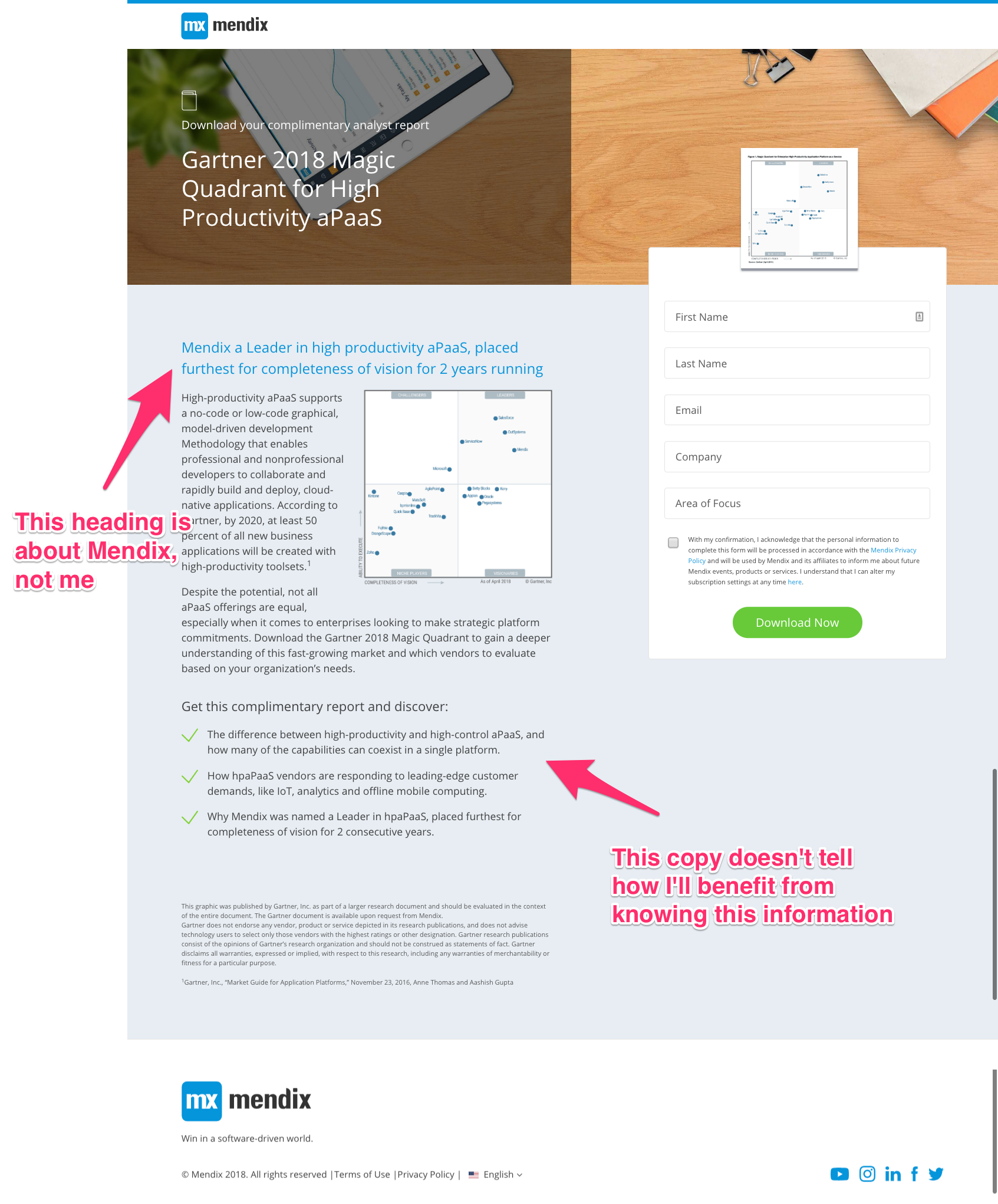
A clean design, prominent form, and simple CTA all come together to form a purposeful, laser-focused landing page. Although I do like the layout of the page overall, the content isn’t all the way there—it never says how knowing all this information will benefit me. I might come out the other end smarter, but is that enough to compel me to give you the required information? And the headline is essentially selling Mendix, not the resource. (Lastly, since I’m an editor by trade, I couldn’t help but notice that the copy seems to have missed the proofreading stage.)
12. Hootsuite
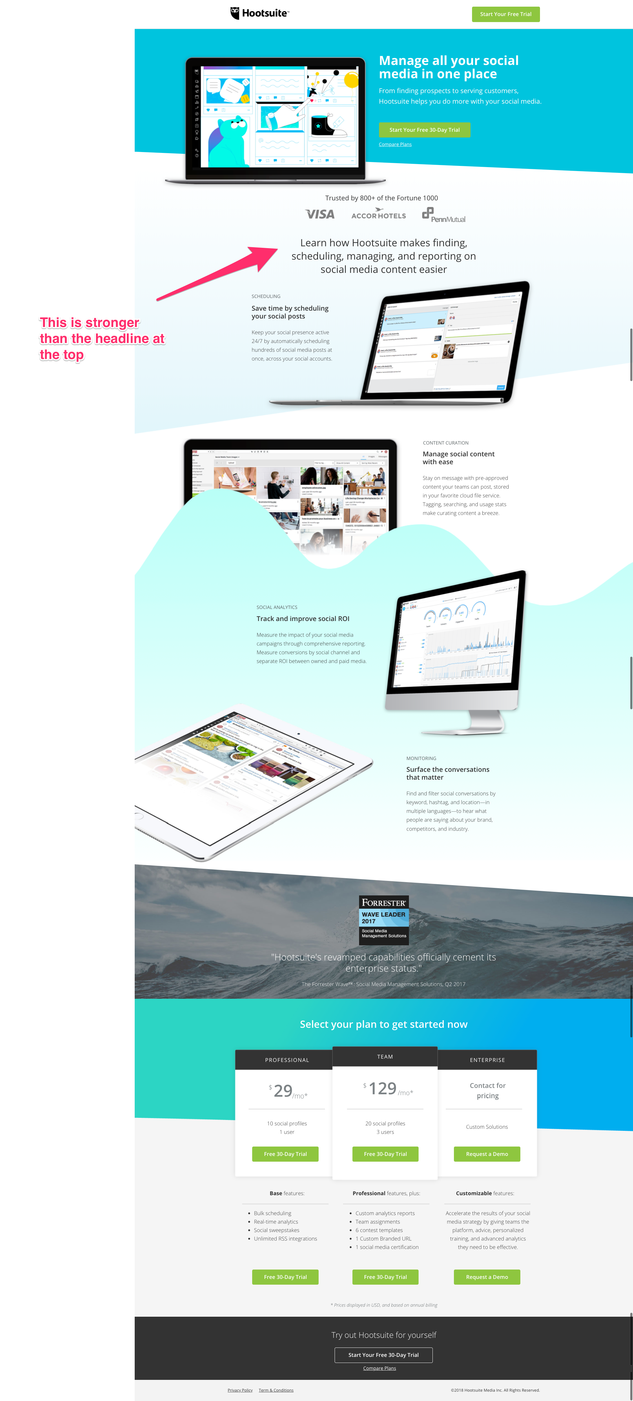
This landing page has a great layout. The CTA button at the top doesn’t make readers worry about pricing just yet—it simplifies matters into a single “Start Your Free Trial” button. If you get to the bottom of the page, you might be more inclined to choose a particular package with which to start. Also, “Trusted by 800+ of the Fortune 1000” is very powerful phrasing—it speaks volumes about the product’s value. The only thing I might suggest is a stronger header. Otherwise, I’m sold: Hootsuite really can help me, and I know exactly how! Where do I sign up?
13. GoToWebinar
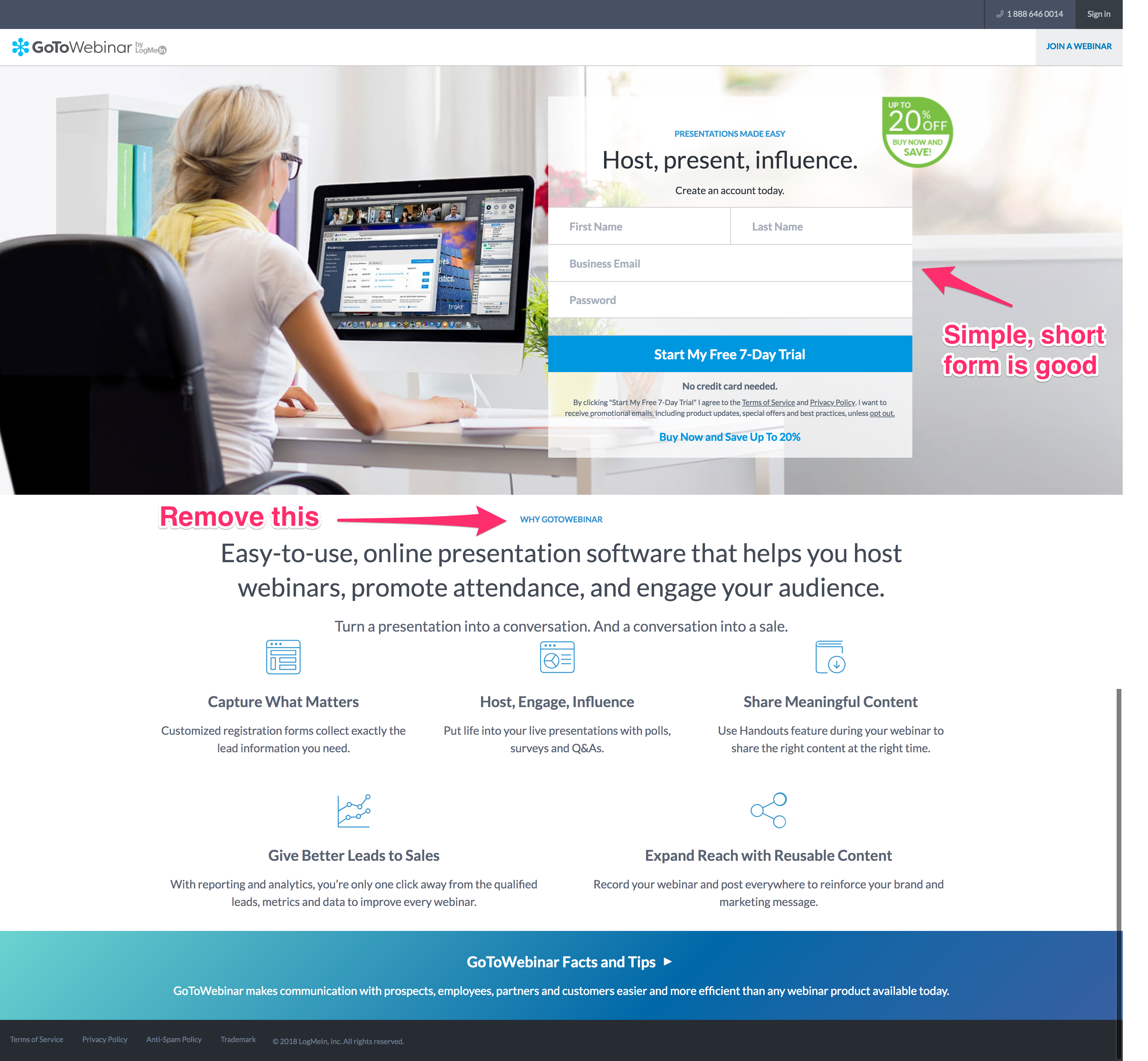
I like the crisp, fun tagline: “Presentations made easy. Host, present, influence.” That’s just what I was hoping to get here. Everything about this page is minimalist, including the form they want us to fill out to get going. Although the wording is a little confusing—is the form to “create an account” or to “start a free trial”?
Another potential area of improvement is the arrangement of the graphics and snippets in the bottom half. Individually they’re well done, but they look at little scattered as a group. I’d also remove the small “Why GoToWebinar” at the top. It takes some attention away from the main headline—and they’re going to tell us why, anyway.
14. Salesforce
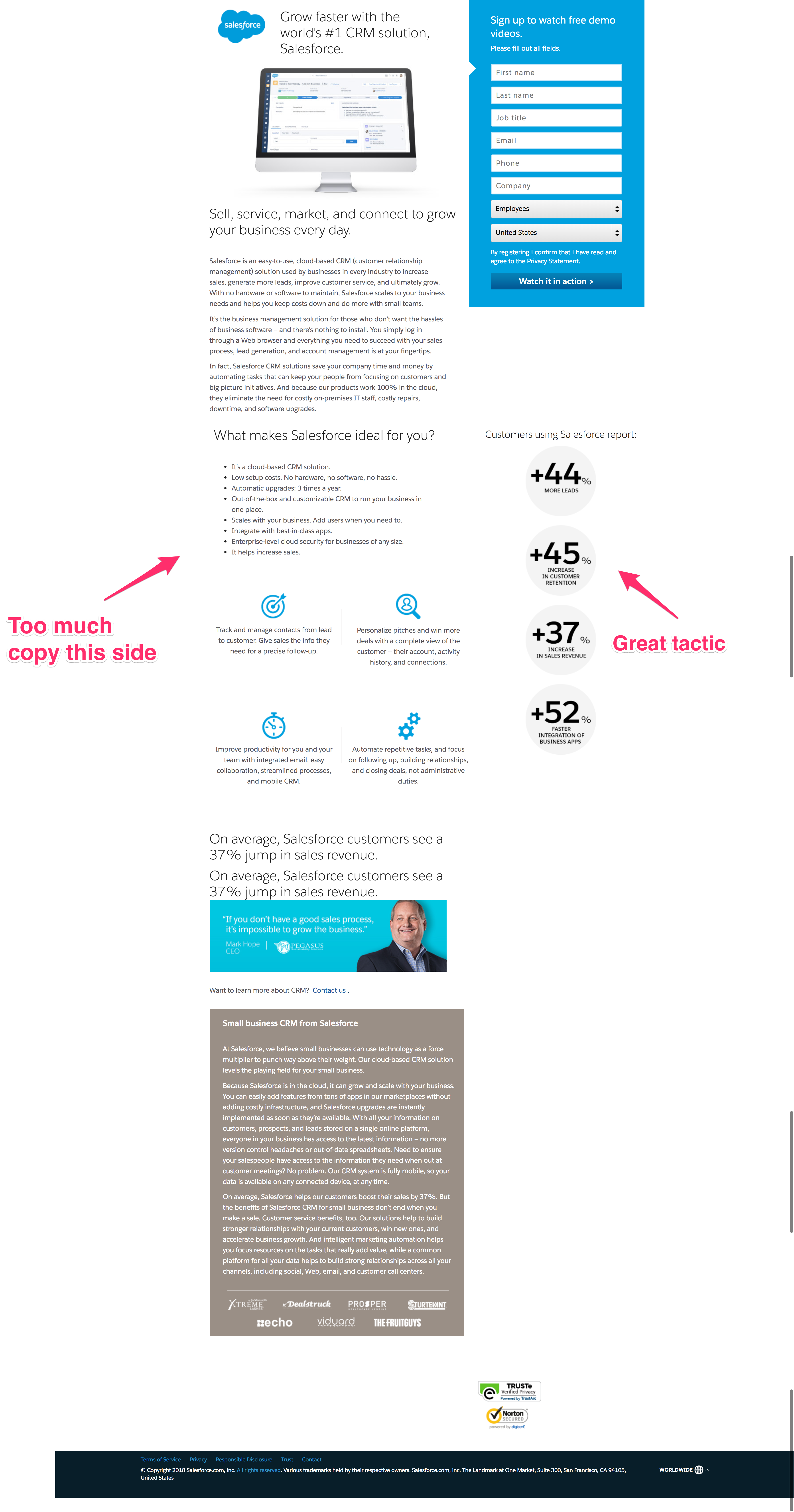
The form on this landing page makes it clear that we’re not signing up for any human interaction—only to watch free demo videos. That’s reinforced by the CTA button, “Watch It In Action.”
But the copy on this page is somewhat misguided. We’re trying to convince people to watch a demo video, not sign up for Salesforce. Some might say it’s one and the same goal, but there’s no mention of what we’ll get from the video. Will we learn how to use it? Will we get more sales stats? Highlights of its features? Case studies of people who’ve used it? I’d like to know before I hand over my information.
I also recommend cutting the amount of text on this page significantly. Visitors are not likely to read the gray box at the bottom (which is even designed to look unimportant). The actual customer data claims are great, though. Focus on those, a few bullet points about the videos, and the form.
15. Planview’s LeanKit
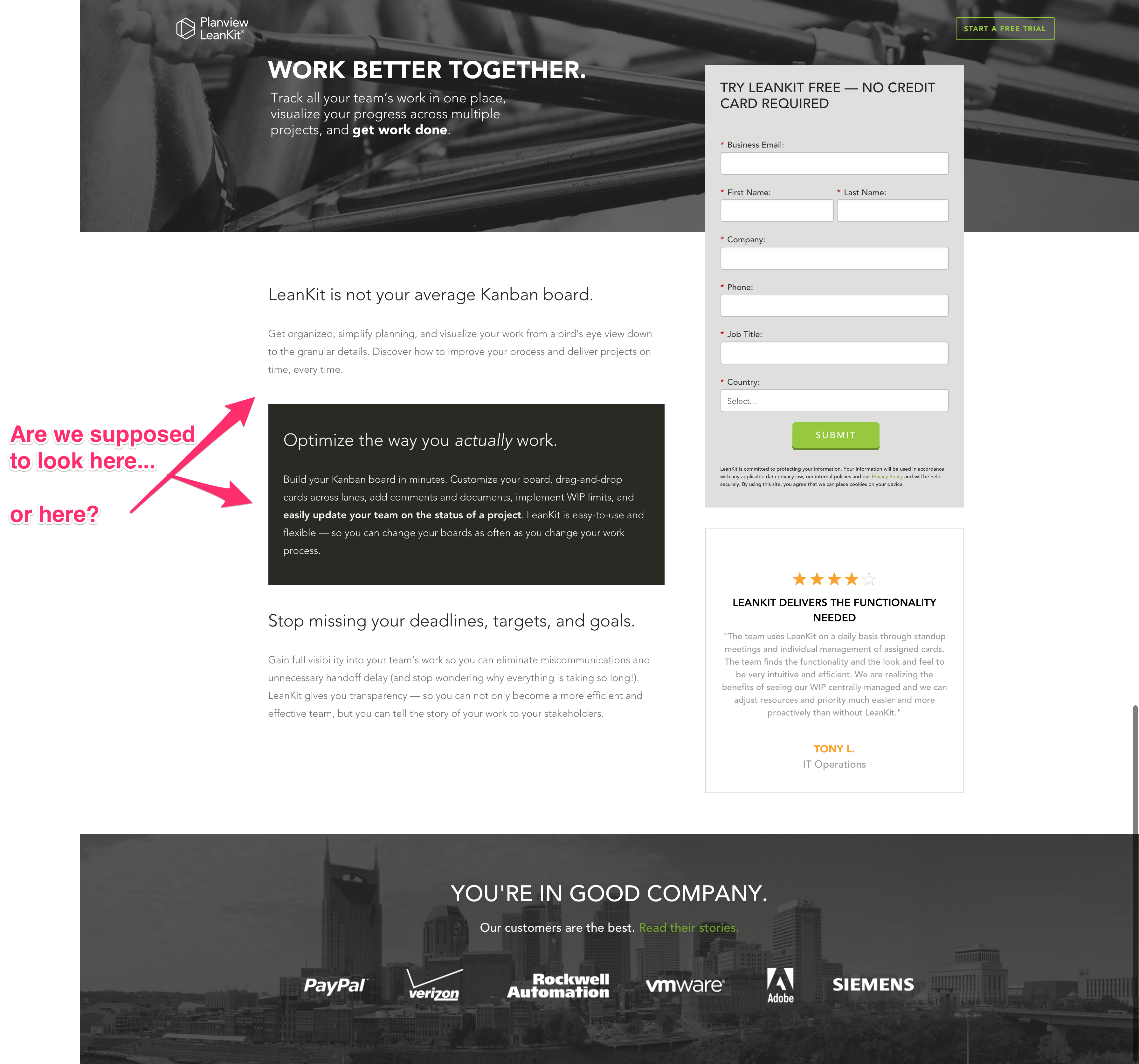
It has a strong tagline and summary sentence—who doesn’t want to “get work done”? I like that the top menu has been stripped down to only the Free Trial button. Also, the customer quote and 4-star review make this landing page very authentic—it’s a different approach to the usual list of customer names. Finally, I also like the page’s color scheme, which conveys efficiency and strength.
The gray box of content in the middle is confusing—usually text boxes are meant to draw attention to content, but in this case, we’re drawing attention away from the first part of the landing page, which is where the eye-catching copy should be located.
16. Carlson Wagonlit Travel
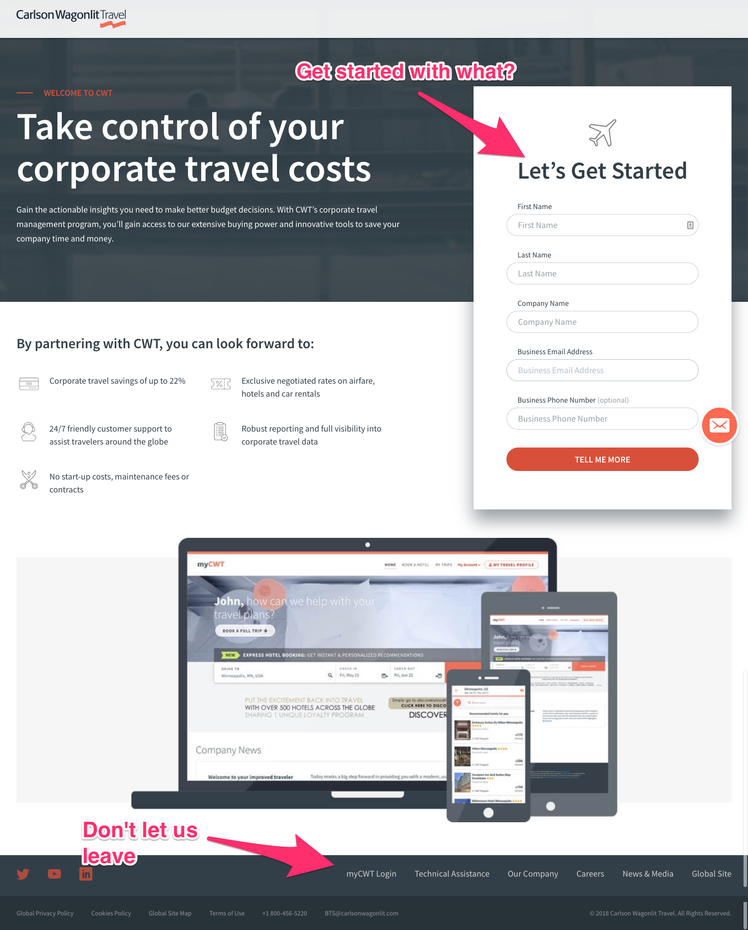
This is an attractive, simple landing page. The short statements and graphics next to the form are nicely done—strong and pointed. And the visual showing what the interaction would look like on all kinds of devices is well-executed.
The main problem: What am I doing here? Am I signing up to work with Carlson Wagonlit? Am I signing up to talk to someone? I don’t know what people know about these products/services before they arrived here; whatever that is may eliminate the confusion. Still, even if people do know why they’re here, it’s always good to be clear.
17. DefendX Software
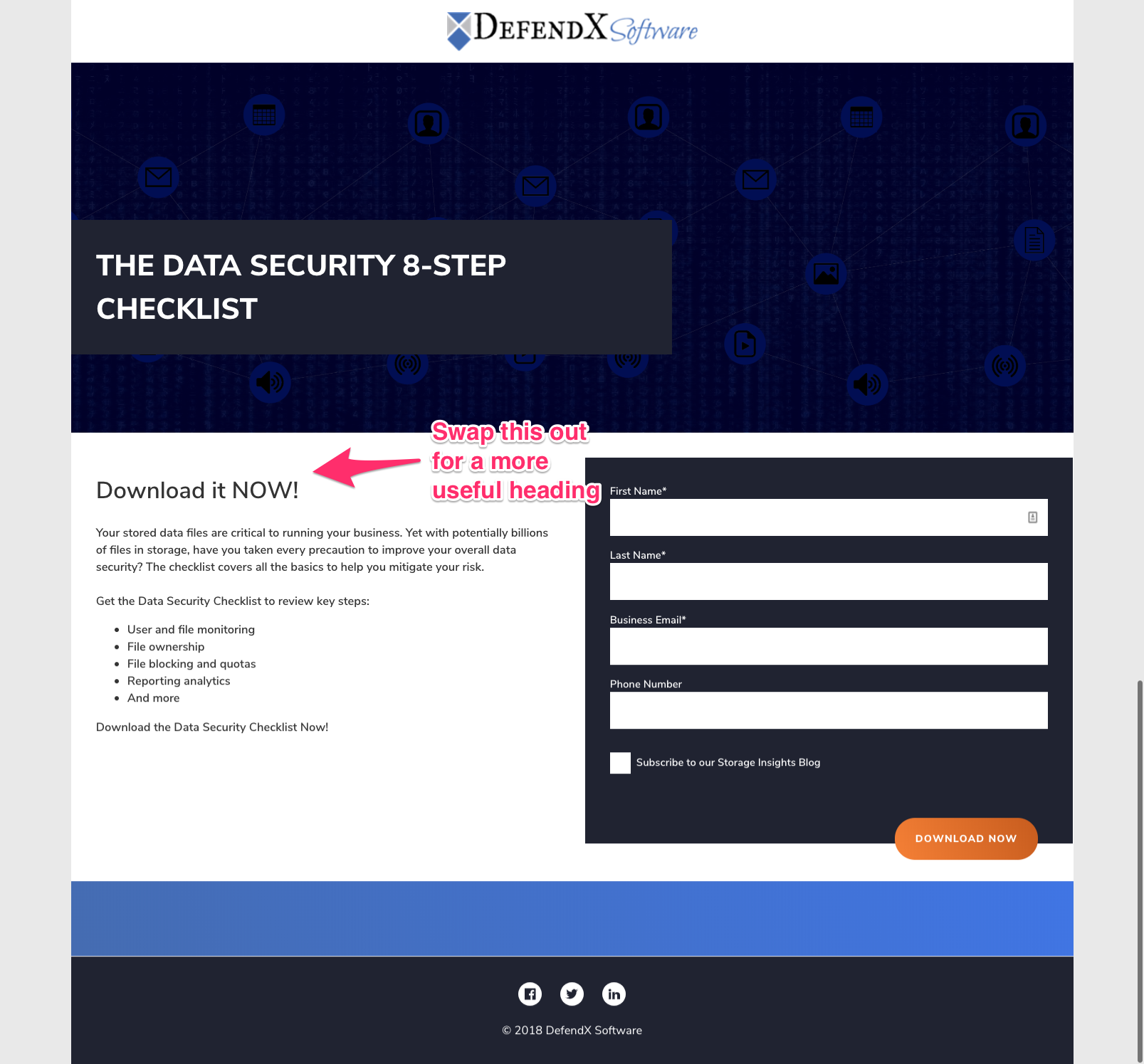
This landing page is direct and to the point without being overly concerned about design. That’s fine, as long as it gets the job done. (This one does, for the most part.) The copy is compelling and makes me believe that the checklist will help me cover all the basics when it comes to protecting my data. My only suggestion: Make use of the heading for something better than “Download it NOW!” Craft a convincing heading about the benefit of what you want us to do, and it will have greater impact on conversions.
18. Magento
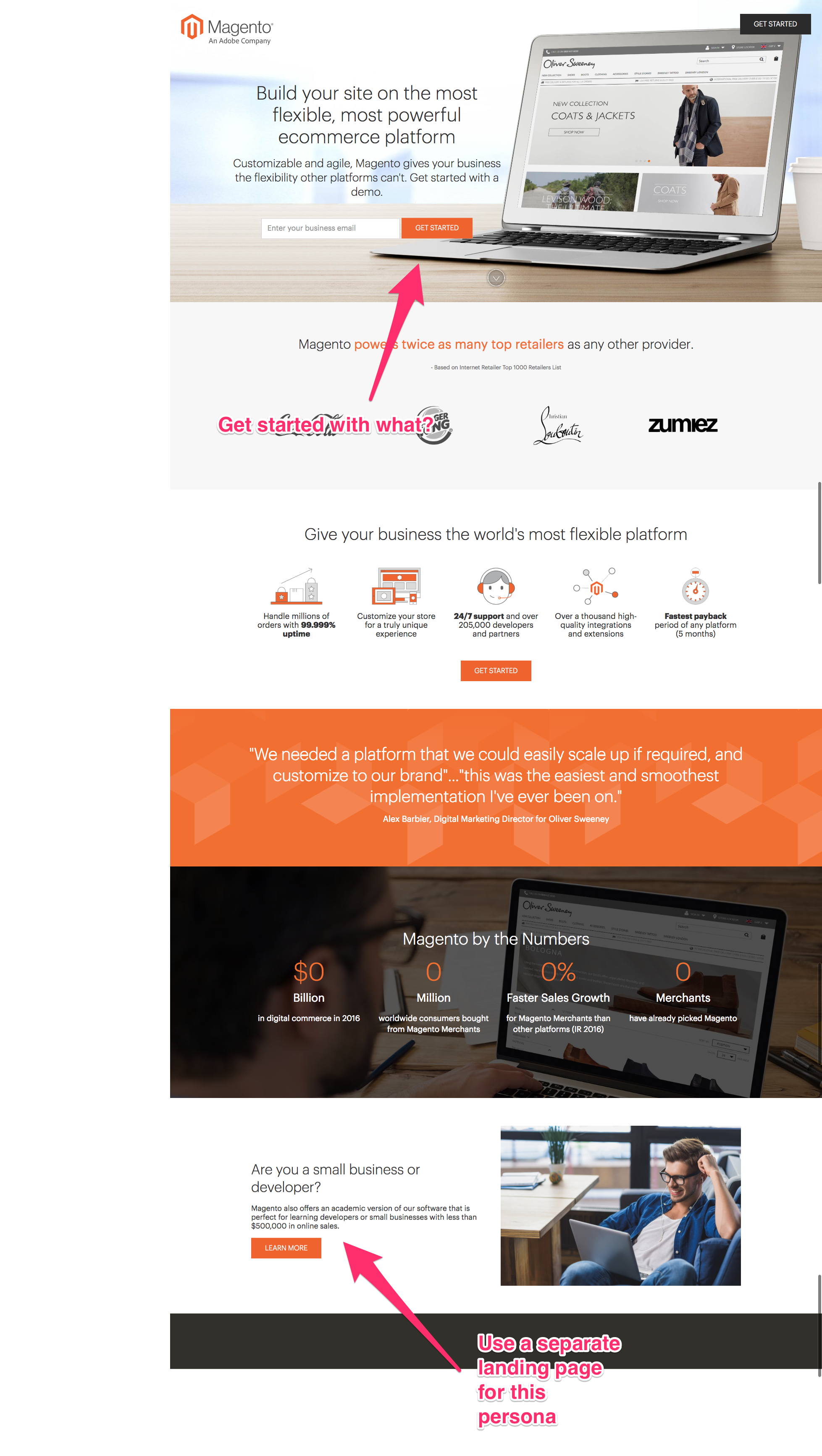
This site comes out of the gate with a strong heading and a strong benefit, addressing the need for powerful functionality and flexibility for eCommerce stores. The same is true for most of the copy on this site: “Fastest payback period of any platform (5 months)” (backed by data); “easiest and smoothest implementation I’ve ever been on” (awesome quote); “30% faster sales growth for Magento merchants than other platforms”—it all paints an impressive picture. And the idea of asking for an email only on this page is a good one—potential customers are more likely to bite. Once they’ve made that micro-commitment, they’ll be more likely to follow through on the next page, which asks for all the usual information before a demo.
There isn’t much I’d change other than creating a more direct CTA button (instead of “Get Started” use “Start My Demo” or something similar); I’d also remove the small business developer section at the bottom, since it’s clearly for a different audience than whoever has arrived here.
19. Dropbox Business
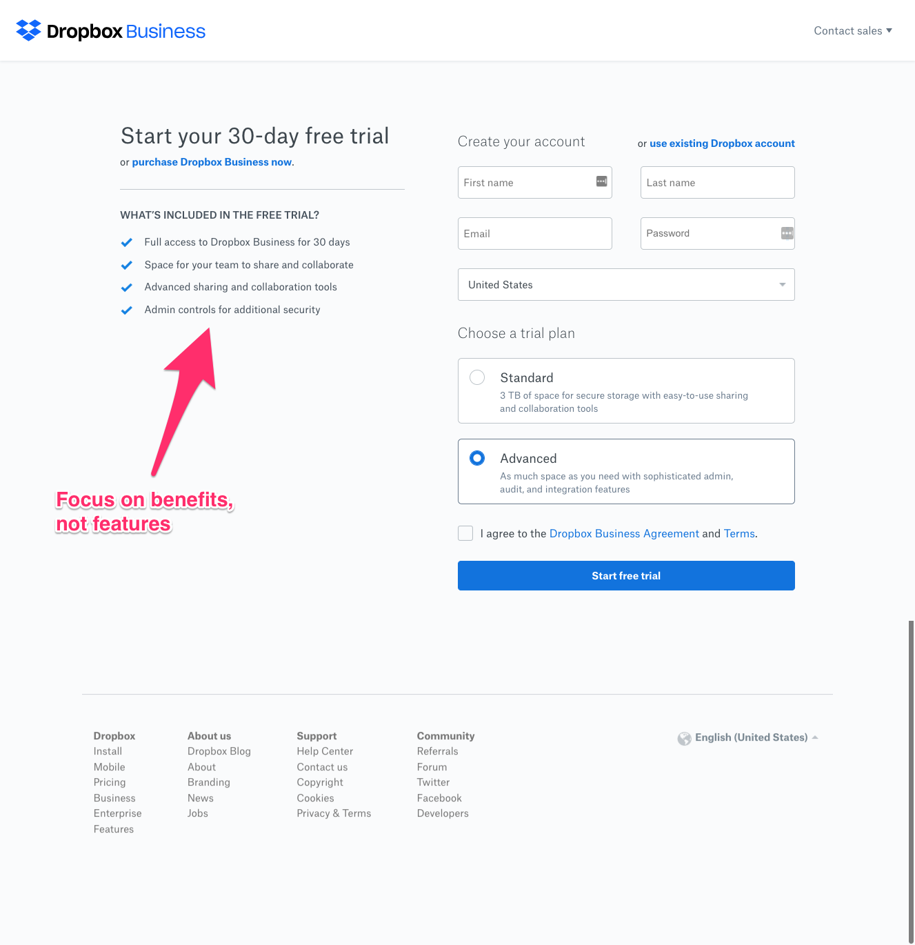
This Dropbox Business landscape is as simple as simple gets. It assumes that, if you’ve landed here, you want to get right down to business and sign up for a free trial. Hopefully they’ve prepared visitors for that—after all, the more they know, the less you have to say. But can you ever really know that for sure? While the simplicity makes things easy, this landing page may not give people enough of a compelling reason to actually hand over their information, since the bullet points focus on Dropbox features rather than benefits for the user.
The only other improvement here would be to delete the extensive navigation links at the bottom of the page. This particular page gives me 21 distractions from signing up for a free trial. If Dropbox is so sure of my intent, why bother with all this?
Helpful tip:
When crafting a landing page, consider the mindset of the visitor and what you’re asking them to do. They either know very little about the topic and/or your company, or they’ve done their research already, which is what landed them there to begin with. The more they know, the less you have to say. At the same time, there are varying levels of commitment on landing pages—are you asking visitors to download a white paper or subscribe to a service? There’s simply no “one-size fits all” formula. Knowing where each of your landing pages fits on these scales will help determine the depth of your content, and/or what questions you need to answer to get people to convert.
20. Appian
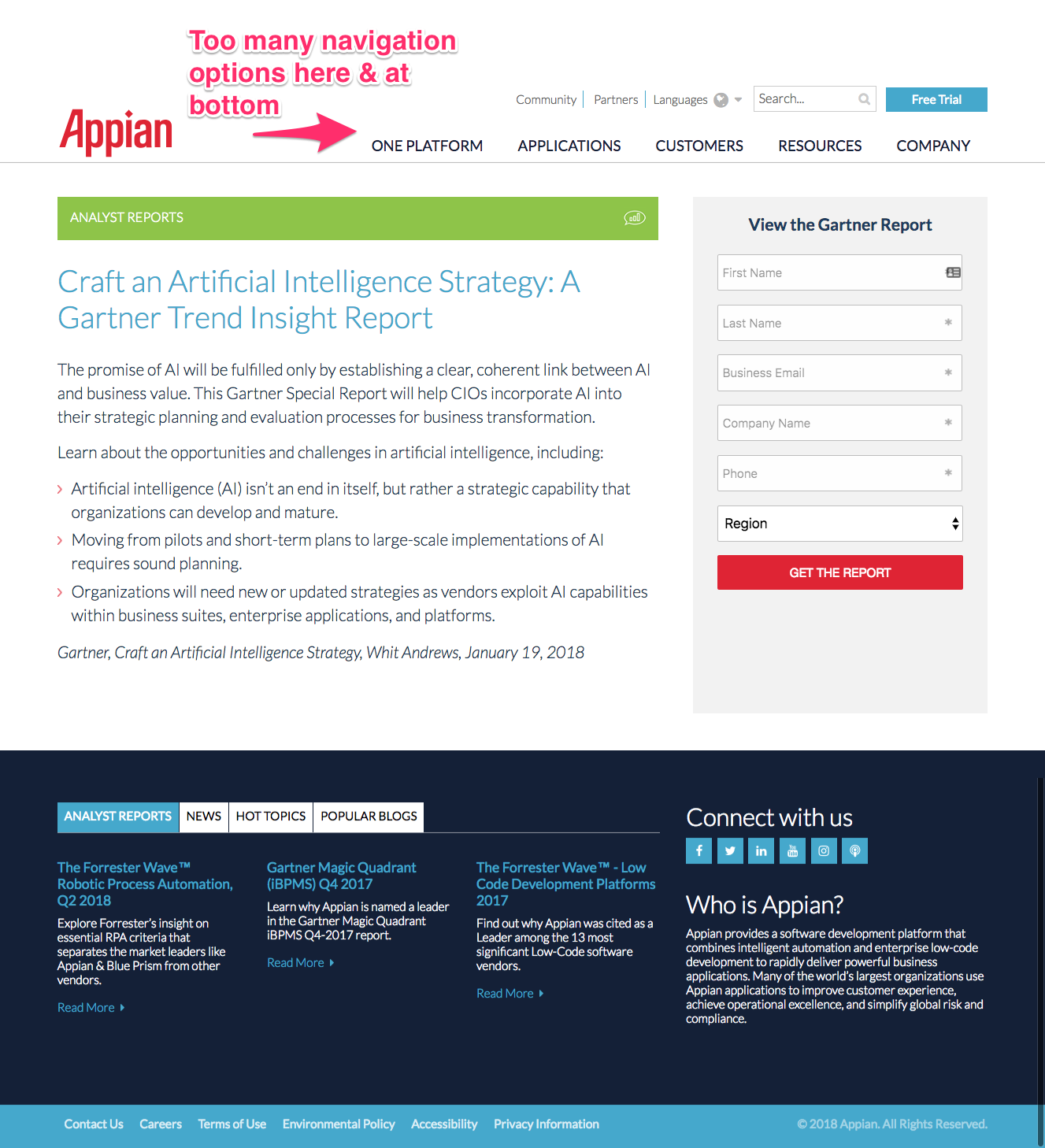
This landing page has strong content—it addresses CIOs directly, tells exactly what the special report will help them do, and gives a few examples of what’s contained inside the report. And everything above the blue box at the bottom looks great, with the exception of two things: There are too many navigation options given, and the blue Free Trial button is confusing—a free trial of what? It conflicts with the page’s main purpose, which is to encourage downloads of the report.
I’d also delete the bottom blue box and everything in it. The fact that it’s a stronger color than the download information detracts from the top half, and it’s simply not necessary to have all this information on a landing page.
21. ADP Payroll Services
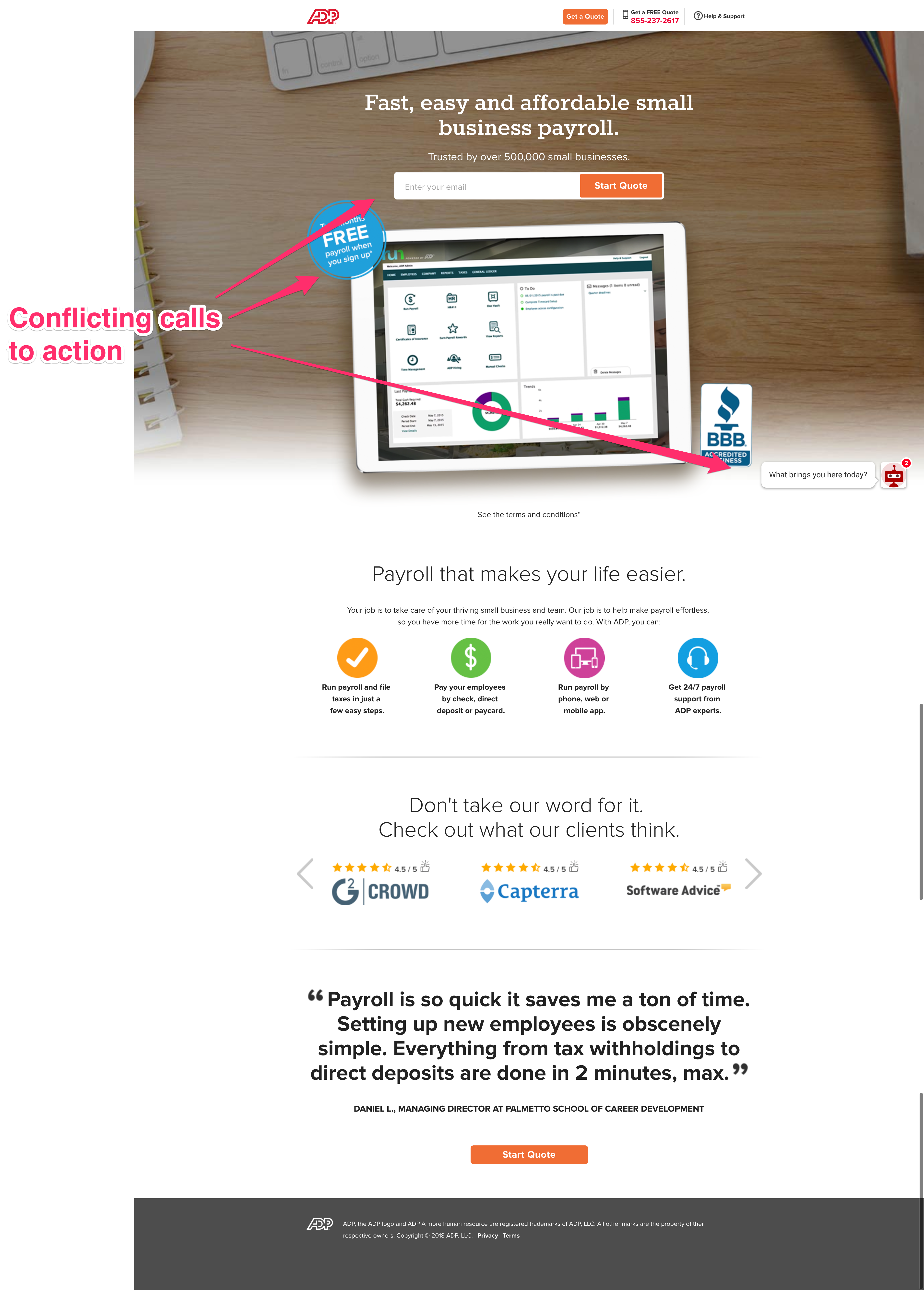
This is a well-designed landing page: It has a short form to start, lots of social proof, and simple, short benefit statements. As far as this first page goes, I bet it converts well.
However, there are some conflicting calls to action: The form is about a free quote; the blue badge is about two months free. And whether or not you like multi-step forms as a user, that doesn’t mean they’re not effective. If you go with a multi-step form, know you’ve added a few layers of complexity to the process on your end because there are more steps for which to track conversion rates.
22. BambooHR
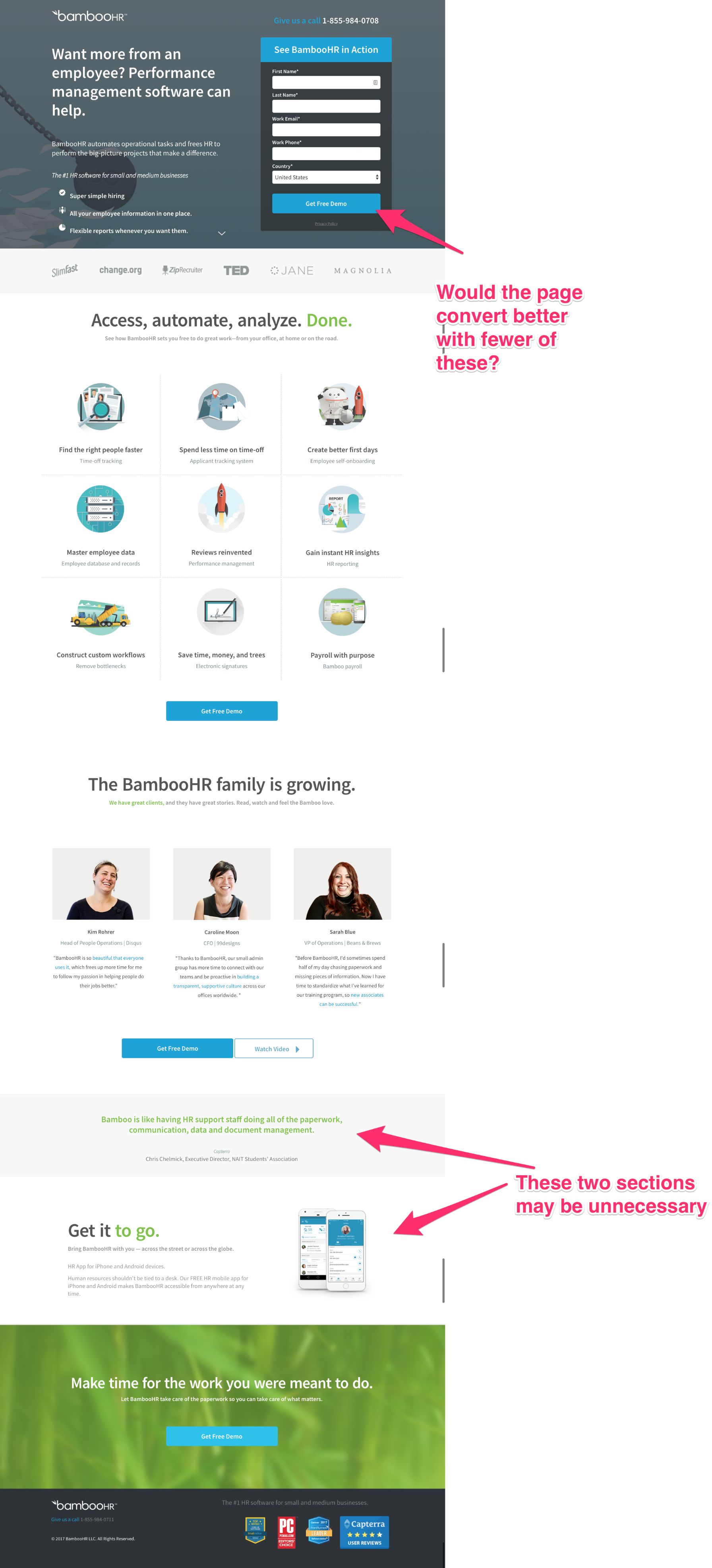
BambooHR has great marketing and copywriting. Like most of their work, this page is well-designed, well-organized, and well-communicated. But, there is still room for improvement.
I’d improve (or at least test) two things: There are four blue “Get A Free Demo” buttons on the page. I wonder if that number was lowered, would the page convert better? Also, they have a testimonials section, and then an additional testimonial pulled out into a different panel. The same is true for benefits (and a mobile benefit pulled out by itself). Those two extra sections could potentially be cut or wrapped into the existing, appropriate sections. Remember to always test your landing pages to inch your way toward better results.
23. Dun & Bradstreet
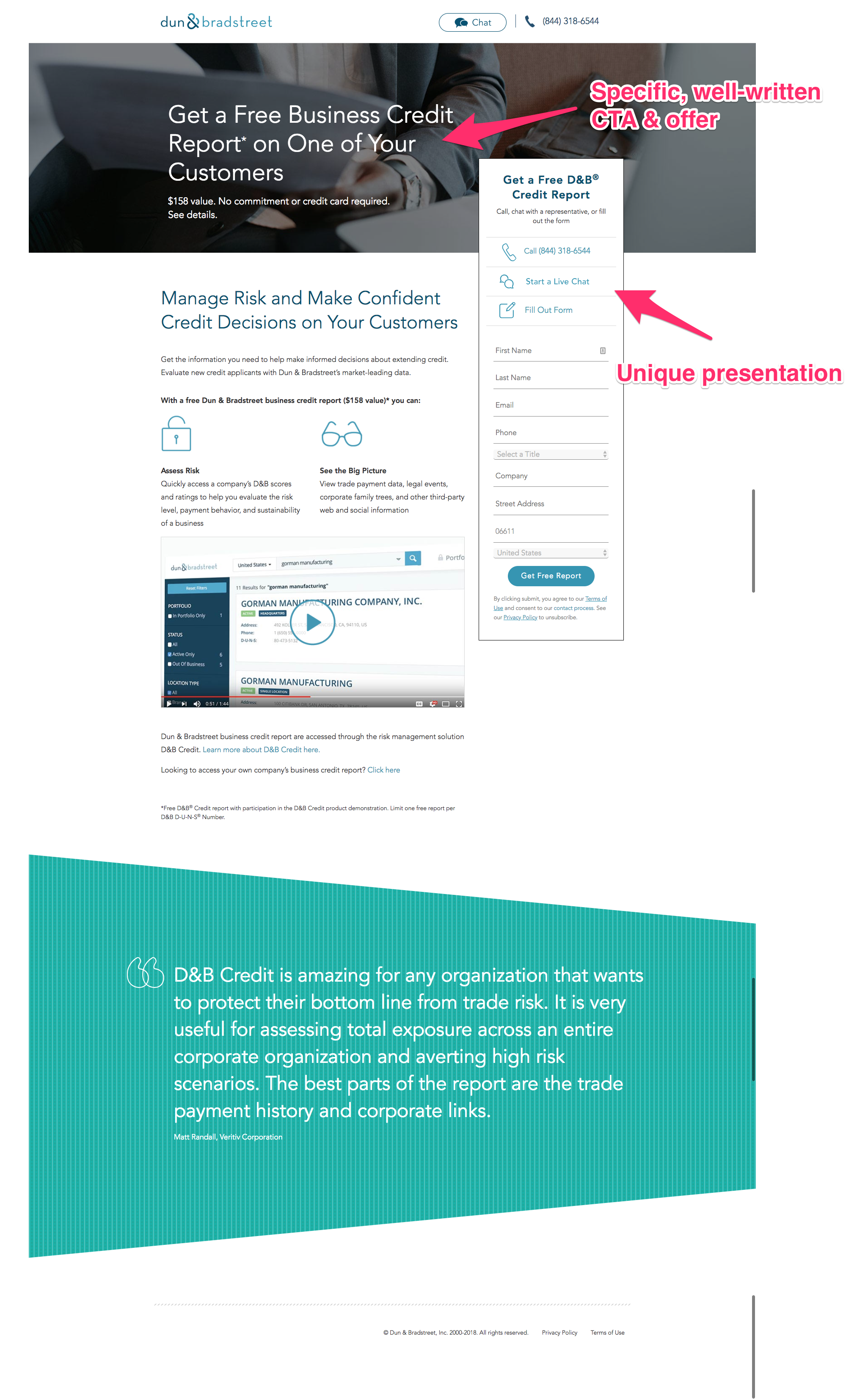
This is a powerful landing page. Forget all the conversion techniques you can deploy—what you’re offering behind a form is always the biggest contributor to conversion rate. Dun & Bradstreet offers a specific, quantifiable credit report for free. That’s value.
I wouldn’t change much about this landing page.
24. Alertfind
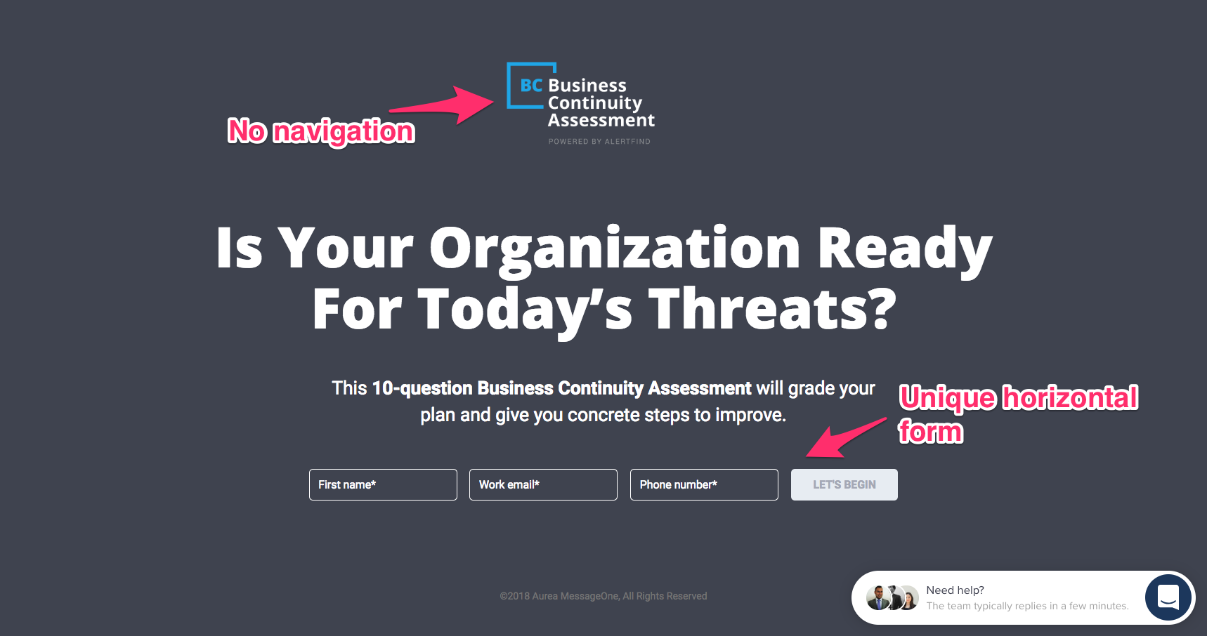
If you can communicate value behind a form in just a few words, it’ll generally lead to a better conversion rate. Alertfind does that really well here. Some other benefits of this landing page:
- All the copy is above the fold (on a desktop).
- There is no navigation or footer, limiting your options outside of submitting the form.
- It communicates clear value and the deliverable.
- It has a short form (which usually means better conversion rate).
25. Front
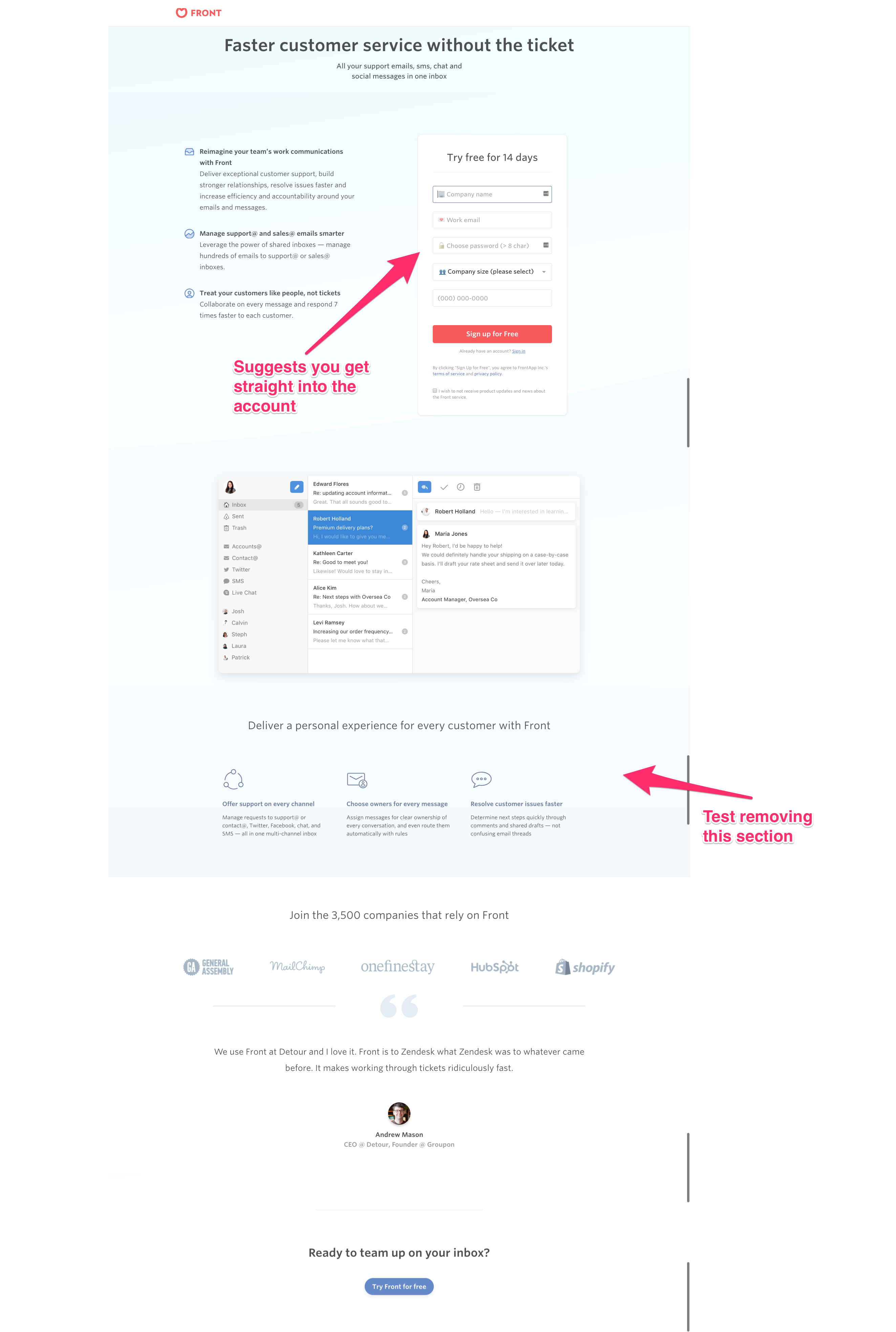
This seems to be an organized and high-performing landing page. The language indicates they understand their persona. You can also tell that the onboarding process takes you right into a test account, without having to talk to a salesperson; and it seems clear that a lot of companies are already using this tool.
The only thing I would test is removing the section that has the header, “Deliver a personal experience for every customer with Front.” It’s the second set of three benefits, and having less copy may work better.
26. MFG.com
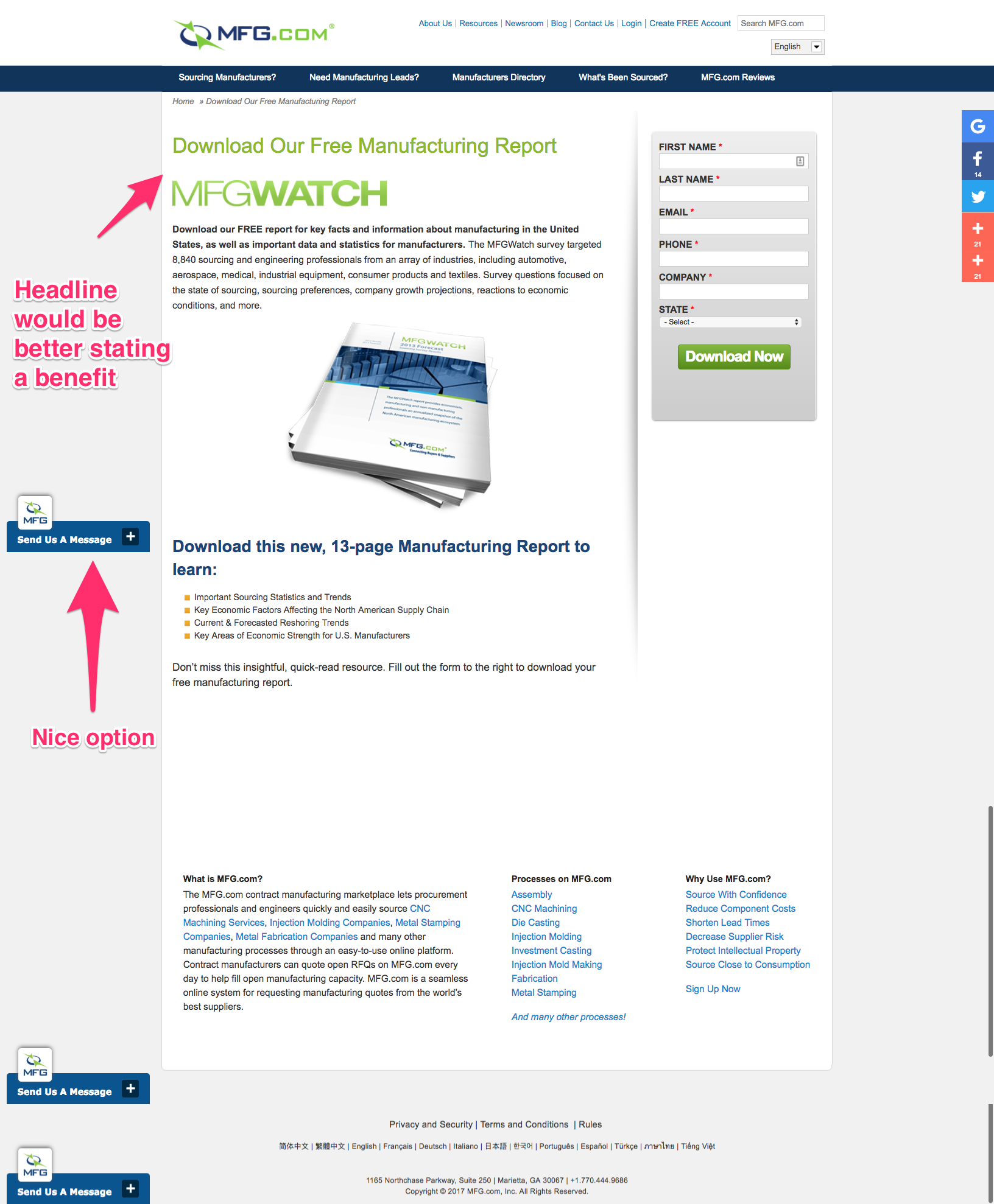
This is be a well-designed web page minus the bottom half (What is MFG.com?, Processes, and Why Use MFG.com?), and without the two navigation bars across the top. The content tells us specifically what’s inside the report, and the visual is nice as well, giving the impression of a very substantive document.
I’d craft a stronger headline. There’s no sense using headline space to direct us to download something. Instead, tell us the benefit of having all this information—how will knowing these manufacturing statistics and trends help me?
27. Glassdoor For Employers
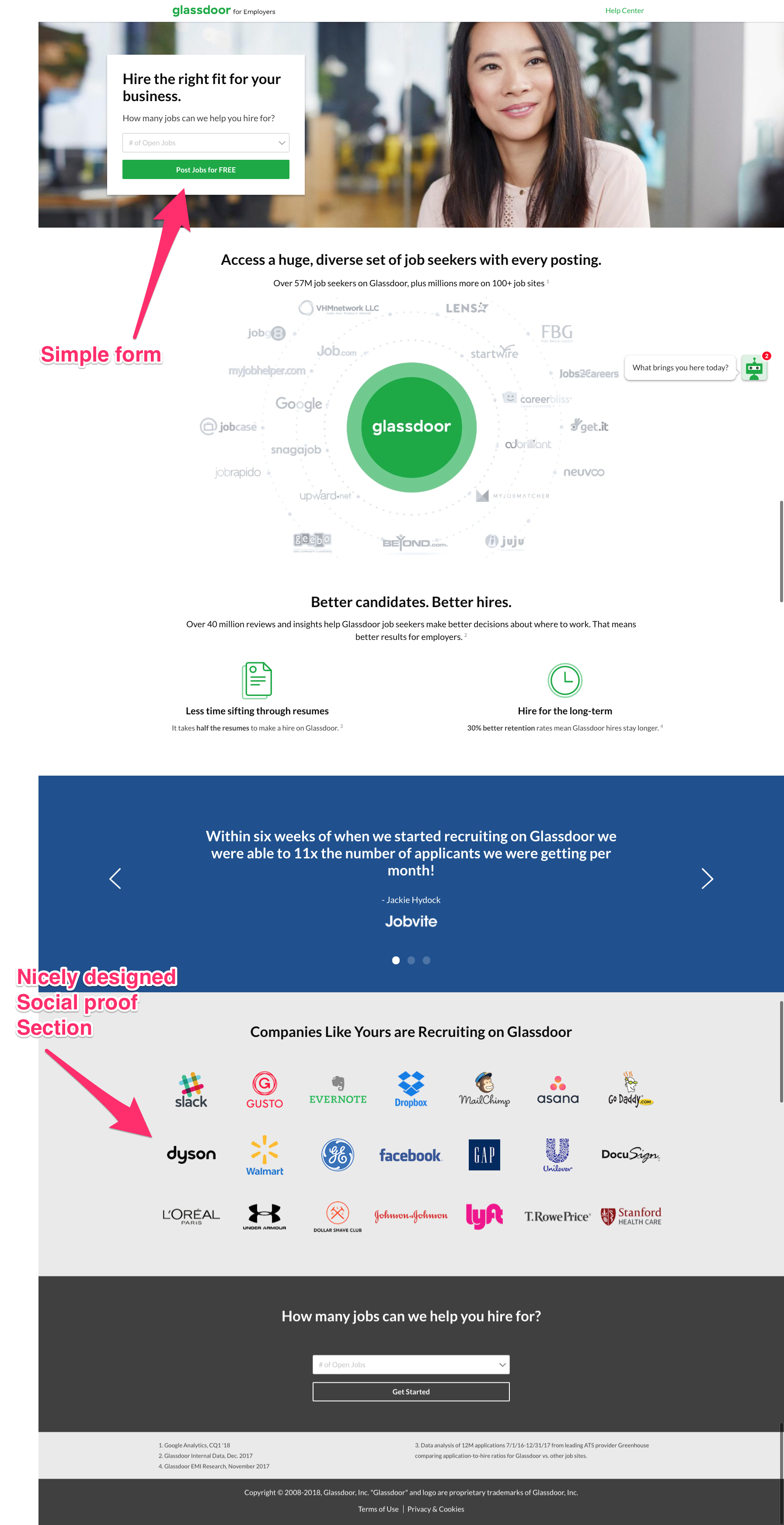
The very simple form at the top of the page asks for only one concrete piece of information that’s very compelling: How many jobs can we help you hire for? (As mentioned in another example, however, the caveat here is that multi-step forms are more complex.) The numbers (57 million, 100+, 40 million, 30% better retention rates) communicate the benefits well, and great visuals add to the appeal. It has an attractive social proof section, too, and great quotes. And repeating the very same question and form at the bottom leaves no confusion about what to do from here.
I don’t think I’d change anything about this page.
28. ADT Business Security
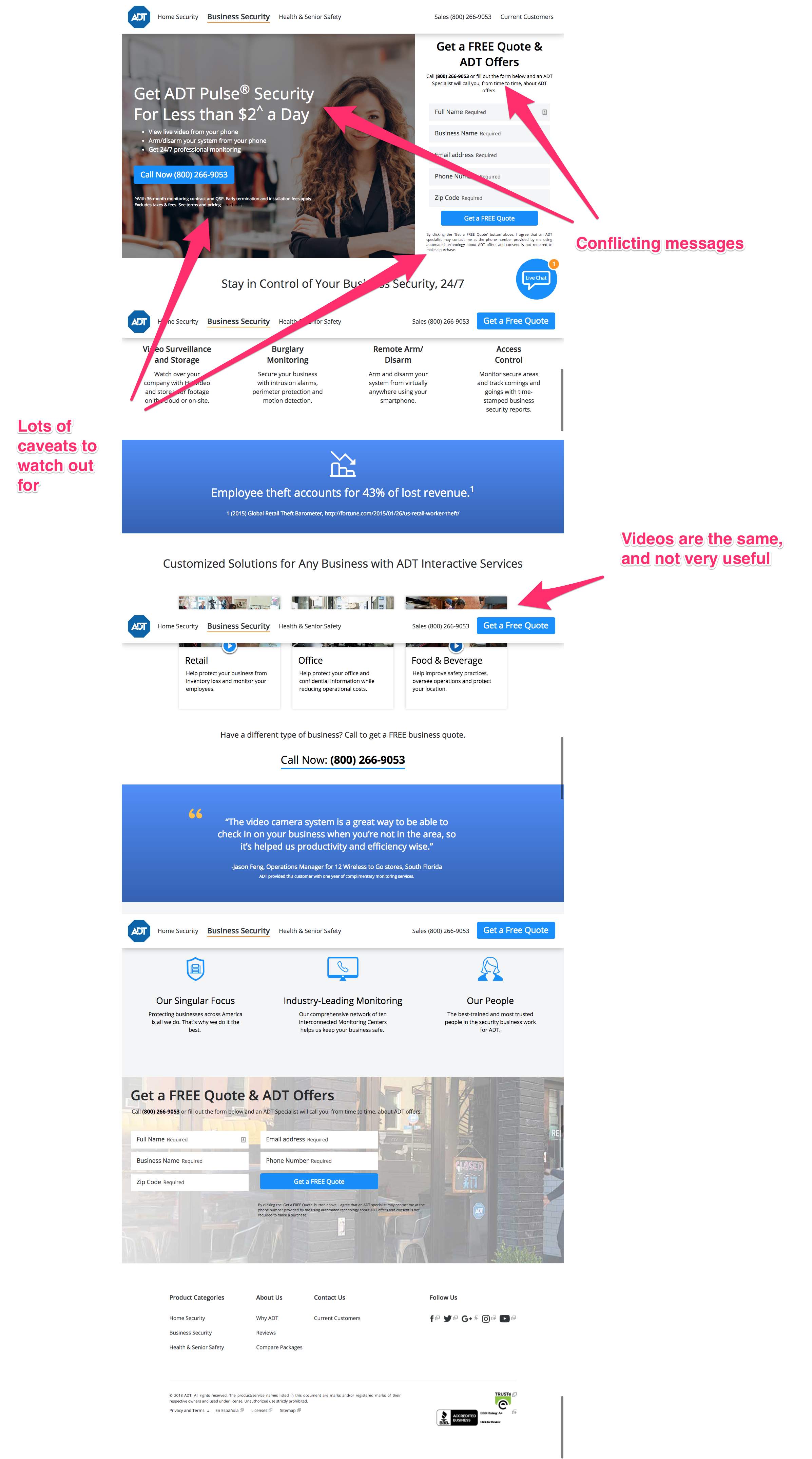
This page seems to be a mashup of the company’s home page and a landing page, with the form stuck on the right of the top section of the existing home page. As a result it’s confusing—are we here for a quote or to get the product? Even the text for the FREE quote is confusing—”a specialist will call you from time to time about ADT offers” if you fill out the form, and you might also get a free quote, I’m not sure which. I’d also imagine most people would prefer to avoid calling, yet the phone number is prominently positioned everywhere on the page. And the videos in the middle are repeats of one another, and not very useful at only 15 seconds long.
There is, however, some good information on this page, such as “Take Control of Your Business Security,” “Why People Choose Us,” and the quote. Trim all this good stuff down and place a neat, concise form across from it and you’ve got the makings of a much better landing page.
29. Tableau
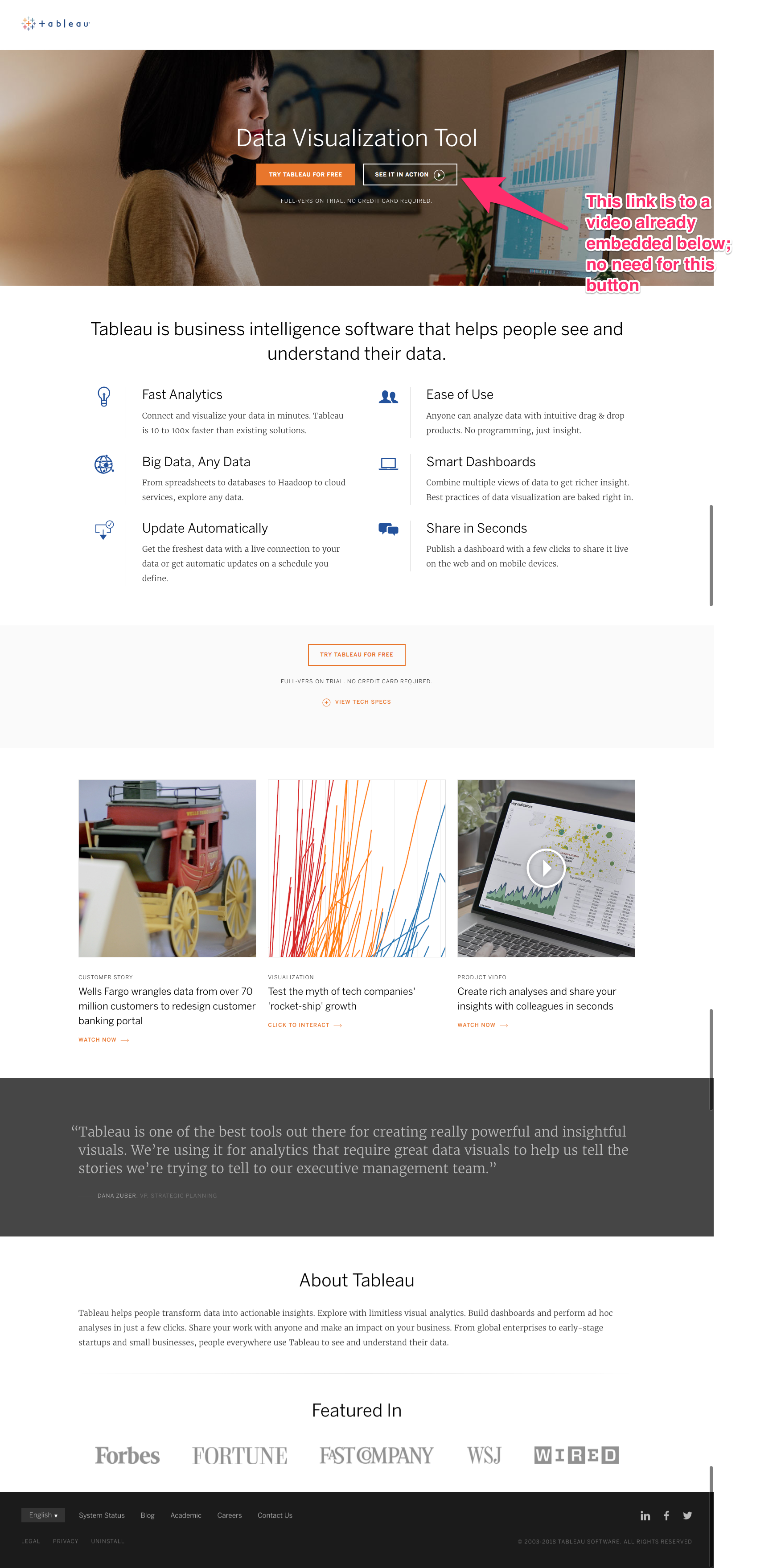
Well-written, well-organized, and well-designed, this landing page from Tableau seems to be doing everything right. The product description and benefits are clear, the social proof is evident, and, thanks to the fact that the clickable sections in the center of the page don’t actually take us away from the landing page, there’s nowhere to go from here except, essentially, to click the orange button and try Tableau for free. (Though I’d remove the “See It In Action” button, which only plays the video also shown below, to keep all the focus on the free trial.)
Helpful tip:
If you’re reaching people on AdWords, make sure the terminology you used in your ad is mirrored and supported in the meta title. For example, if I search “data visualization tool” Tableau comes up with a page that has a meta title of “Tableau Data Visualization | Download A Free Trial Today.” If I search “big data visualization” Tableau comes up again with a meta title of “Tableau Data Visualization | See Your Data In A New Light.” By matching your page to the exact topic visitors are hoping to find you have a better chance of converting them.
30. Fitbit Health Solutions
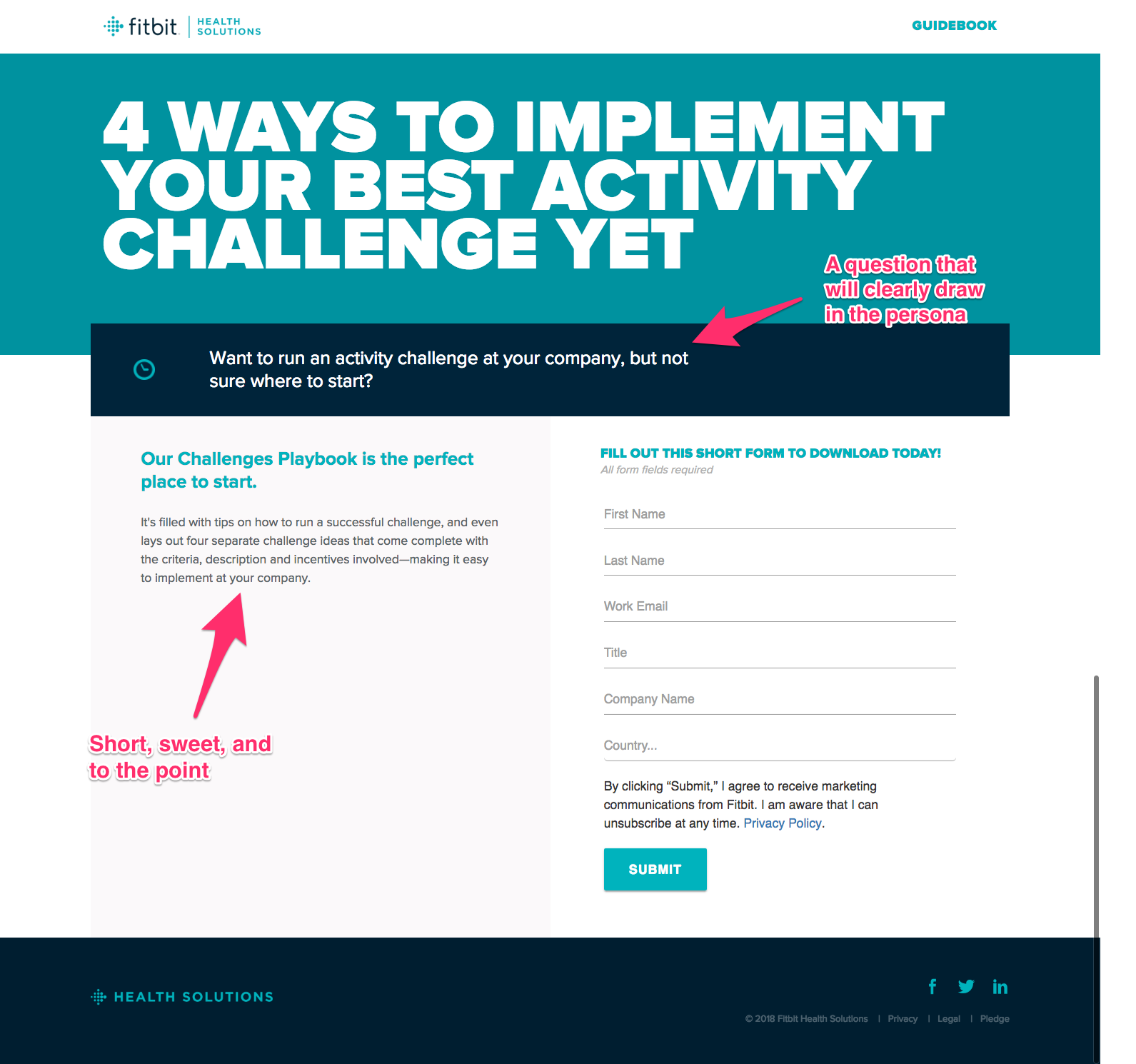
And… we end on a high note, with what I consider to be a strong landing page from Fitbit. It has minimal text and design, but it’s absolutely clear what I’ll get out of this download. There’s nothing to draw my eye away from the form or the page; clearly I don’t need much convincing now that I’ve arrived here. I’d be willing to bet this is a high-converting page.
Want yours to be among the best B2B landing pages?
It’s part of what we do! We’re a growth content company that helps B2B companies radically grow their online presence and attract more quality leads. To do that, we craft all types of authoritative content that your prospects can’t resist—and the landing pages that go along with them at every stage of the funnel. If you’d like to talk with us about your company’s growth content potential, then let’s chat.

