15 of the Best B2B Websites (& What Makes Them Shine)


It’s pretty much impossible to determine how many B2B websites exist out there on the interweb, but let's just say there are a LOT. And it’s safe to say that many of them leave a lot to be desired (trust me, I’ve spent weeks analyzing them). So what makes a B2B site stand out? And how do we know if what they’re doing is working?
We started by scouring the internet and compiling the best B2B website designs we could find. Some things we considered when looking at each site were:
- Is the homepage compelling?
- Does the site have eye-catching visuals overall?
- How’s the CTA placement throughout?
- Are there any insightful case studies or client testimonials?
From there, we put together some high-level statistics about each website that we pulled from Semrush, to make sure their B2B website strategy was actually working for them.
So if you’re looking for a little inspiration for your own site, here are, in our view, 15 of the best B2B websites on the internet right now.
1 WeWork
Semrush Stats:
- Authority score: 67
- Estimated monthly organic visits: 1.5 million
- Page one keywords: 13K
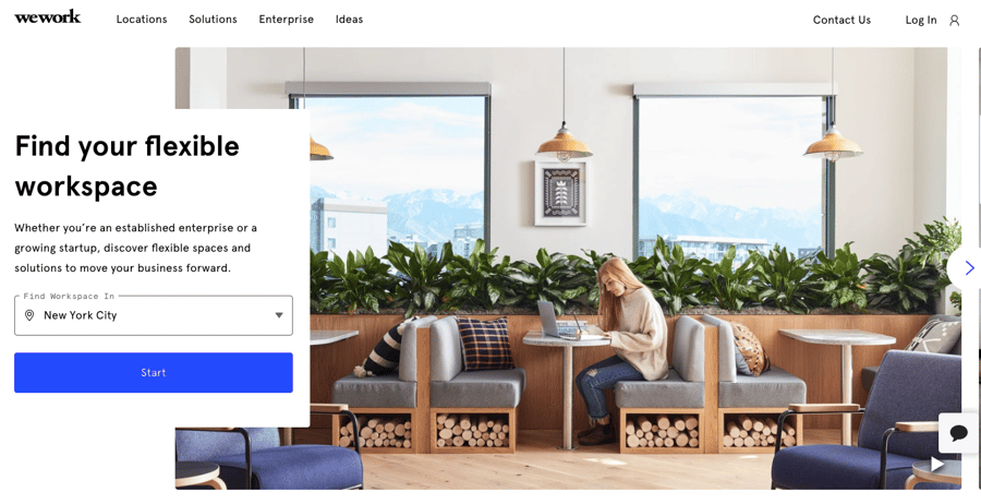
As soon as you land on WeWork’s website, you immediately want to be transported from your stuffy cubicle or cluttered home office to one of their beautiful workspaces. Everything about the site is clean and inviting, and there’s no wondering where their locations are or the benefits of a WeWork space—it’s all clearly displayed in the first half of the homepage. (And their clear response to COVID-19 is also a welcome sight, as health and safety protocols are top of mind for businesses and individuals alike.)
2 Mailchimp
Semrush Stats:
- Authority score: 81
- Estimated monthly organic visits: 4.8 million
- Page one keywords: 20K
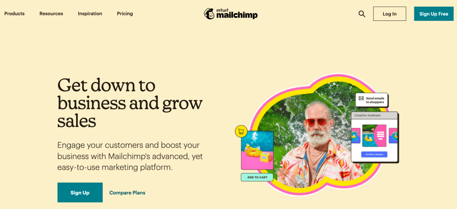
Not only does Mailchimp clearly outline all of the features of its email marketing platform right on the homepage, but each feature is hyperlinked, allowing you to dive deeper into the tools that are of interest to you. And kudos for providing an easy-to-understand pricing page—gotta love a company that doesn’t bury (or completely hide) how much their product costs.
3 MongoDB
Semrush Stats:
- Authority score: 72
- Estimated monthly organic visits: 2.7 million
- Page one keywords: 21K
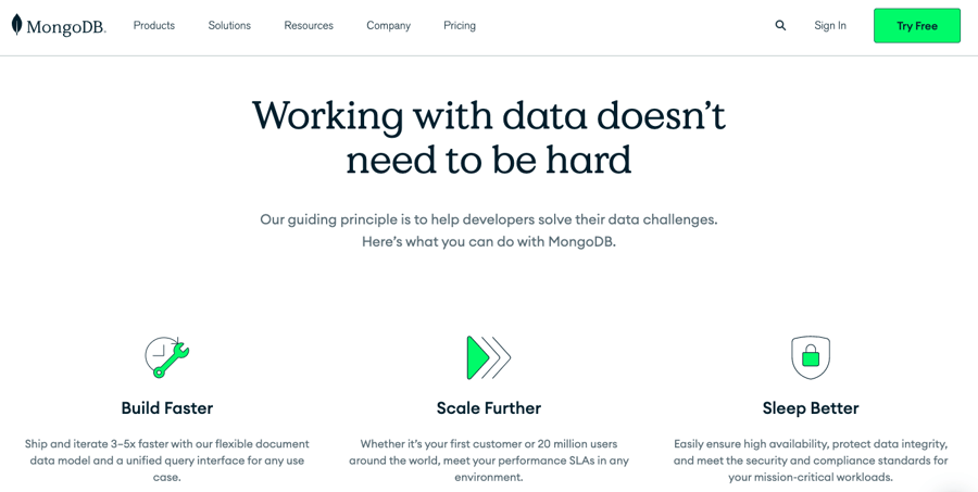
Unlike Henry (Nectafy’s data-loving director of operations), I’m not a big numbers person. So when a website clearly states that working with data doesn’t need to be hard, I’m sold.
MongoDB does an excellent job of simplifying what many perceive as a complex industry. The cloud-based document database for application developers has an incredibly user-friendly website, nailing all the must-haves on a homepage: a clear and concise header, consistent CTAs throughout for a free trial, top product features, testimonials, use cases, and more.
4 Procore
Semrush Stats:
- Authority score: 65
- Estimated monthly organic visits: 590K
- Page one keywords: 10K
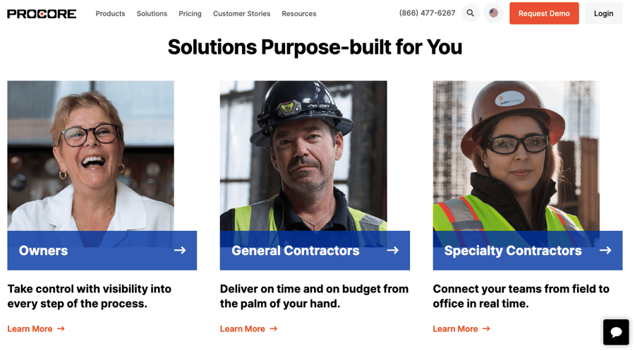
There’s no need to guess if Procure is the right construction management software for you or your business. They’ve clearly called out who will benefit from their platform (and how) right on their homepage—a winning B2B website strategy. The visuals throughout the site are excellent, allowing you to see how the software looks on both a computer and phone screen. And the “Request a Demo” CTA is strategically placed across the site without being too in your face.
5 Toast
Semrush Stats:
- Authority score: 74
- Estimated monthly organic visits: 880K
- Page one keywords: 13K
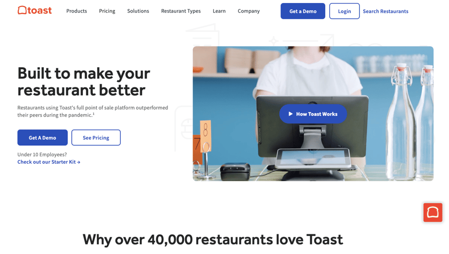
Toast, a point of sale platform for restaurants, kind of makes me wish I owned a restaurant just so I could use their POS. (That’s when you know you’ve found a good B2B website example, right?) The website grabs your attention as soon as you land on it, with a simple video showing how Toast works. The best part? The video is silent until you click the How Toast Works button, at which point you’re presented with a more in-depth audio video. (There’s nothing worse than landing on a website and immediately being blasted with loud audio, IMO.) I also really like the typography, graphics, and customizable solutions. Overall, a really well done B2B website.
6 Boxmode
Semrush Stats:
- Authority score: 50
- Estimated monthly organic visits: 7K
- Page one keywords: 198
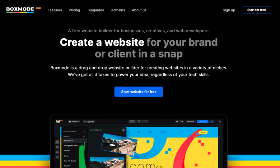
Offering anything for free is a strategy I can get behind. But really, Boxmode’s messaging for their free website builder is so compelling, it makes me want to give it a try. The website pushes a “start for free” CTA throughout, which inevitably leads to some skepticism, so I really appreciated the “questions you might have” section of the homepage that quite literally answered all the questions running through my head. Not to mention the benefit of being able to browse their templates before signing up. This B2B website has me hooked.
7 monday.com
Semrush Stats:
- Authority score: 71
- Estimated monthly organic visits: 3.8 million
- Page one keywords: 13K
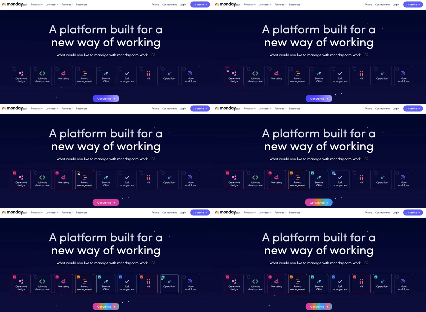
I absolutely love the interactive features of monday.com’s website. Right away you know that this project management company is able to tailor their platform to your team’s needs, which is a major selling point. (And when you select the different areas of your business you want to manage, the CTA changes colors, which is surprisingly fun to interact with!) Some other great features that make this an exceptional site are their perfectly placed customers (some big names!), visuals of the platform throughout, a sticky nav so you can easily explore other pages, and a resource center chock-full of information.
8 Canva
Semrush Stats:
- Authority score: 77
- Estimated monthly organic visits: 78 million
- Page one keywords: 127K
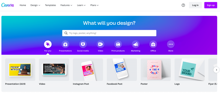
Where do I even begin with Canva? This website is a dream to interact with. From the easy-to-use search tool at the top of the homepage to the in-depth features pages, it’s a breeze to find what you need on this online design and publishing tool’s website. Not to mention they have a CTA for everyone. Whether you’re looking for a free trial, a demo, or you’re ready to sign up, Canva makes it easy for you to take the next step.
9 Zendesk
Semrush Stats:
- Authority score: 89
- Estimated monthly organic visits: 9 million
- Page one keywords: 205K
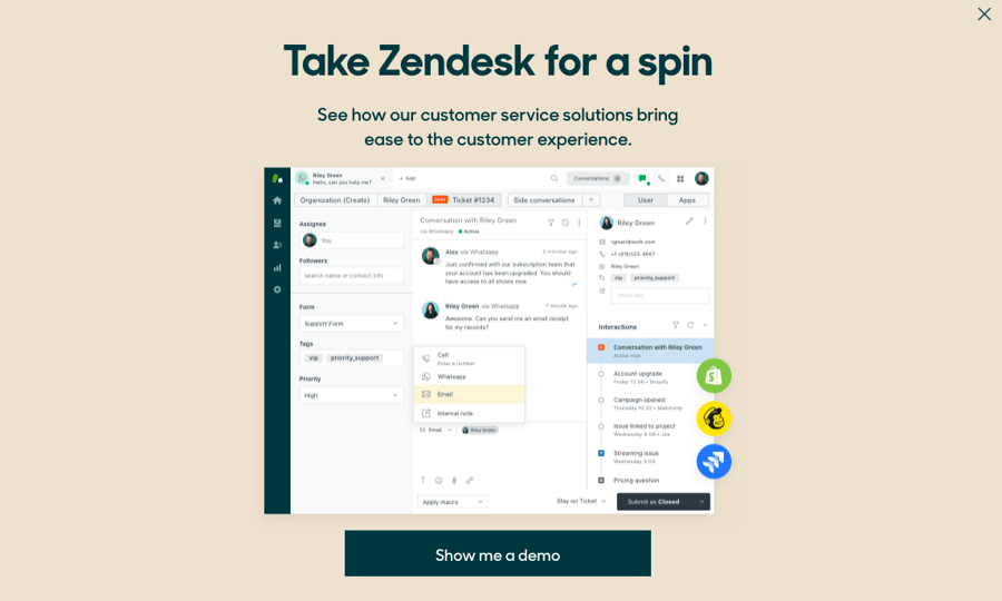
“I love website pop-ups!” said no one ever. But really, this exit pop-up from Zendesk is good. The large size makes it impossible to miss, the headline is catchy, and a screenshot of the actual software makes it especially eye-catching. (I’d love to know how it performs!) Other notable features of this customer service software website include a transparent pricing page and an easy to navigate and resourceful blog. Also, I love how the demo page tells you all the things you’ll have access to in exchange for your email address. Job well done, Zendesk.
10 Miro
Semrush Stats:
- Authority score: 68
- Estimated monthly organic visits: 5 million
- Page one keywords: 11K
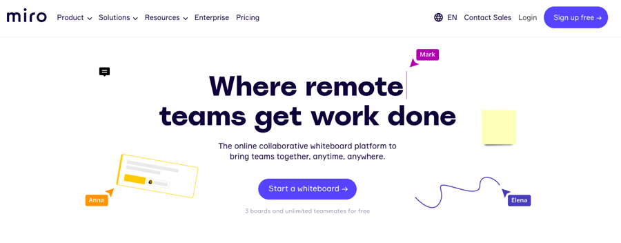
Miro is a new-to-me B2B website, and as soon as I landed on the homepage I already wanted to sign up and explore the collaboration platform more. The changing headline is compelling; there are endless screenshots of the platform throughout the site; and the product overview page is exceptionally well done, highlighting everything you might want to know about the platform, leaving nothing to the imagination.
11 Bugsnag
Semrush Stats:
- Authority score: 57
- Estimated monthly organic visits: 33K
- Page one keywords: 560
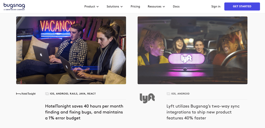
One of the things we always encourage our clients to add to their website are case studies, as they’re great proof of concept for prospective clients. Bugsnag, which provides error monitoring and app stability management, has an incredibly impressive customer story section on its site. Featuring notable companies like Dropbox, Lyft, and Yelp, with each story highlighting the challenge that the company was facing and the results after working with Bugsnag, this is one of the best case study sections I’ve seen.
12 Spendesk
Semrush Stats:
- Authority score: 55
- Estimated monthly organic visits: 125K
- Page one keywords: 2K
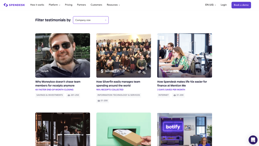
The catchy headline, CTA placement, and clearly outlined features are all great—but it’s the customer testimonials that really shine on this B2B website. Spendesk, an all-in-one spending solution for finance teams, has more than 20 testimonials on its site, filterable by company size. And each testimonial has an easy-to-read layout, making them easy for prospective customers to skim through.
13 Namely
Semrush Stats:
- Authority score: 56
- Estimated monthly organic visits: 84K
- Page one keywords: 2K
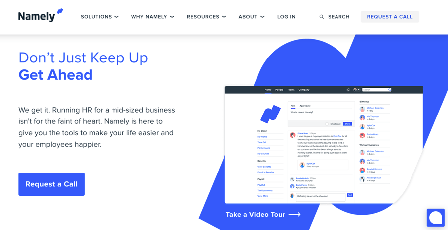
Ever land on a website to discover you have no idea who the intended audience is? Well this site leaves nothing to the imagination. Namely, a modern HR platform, explicitly states their intended audience in a number of spots throughout the site. And not only do they say “mid-sized businesses,” but they even define what exactly that number is (25-1,000 employees), which saves a prospect a lot of time right from the start.
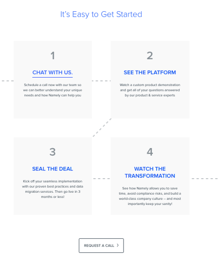
In addition to the all-around nice design (appropriate CTAs, white space, attractive imagery, etc.), another standout feature is the clear roadmap of how to get started with Namely (as seen below) so businesses know exactly what to expect of the sales process.
14 Asana
Semrush Stats:
- Authority score: 73
- Estimated monthly organic visits: 5 million
- Page one keywords: 21K
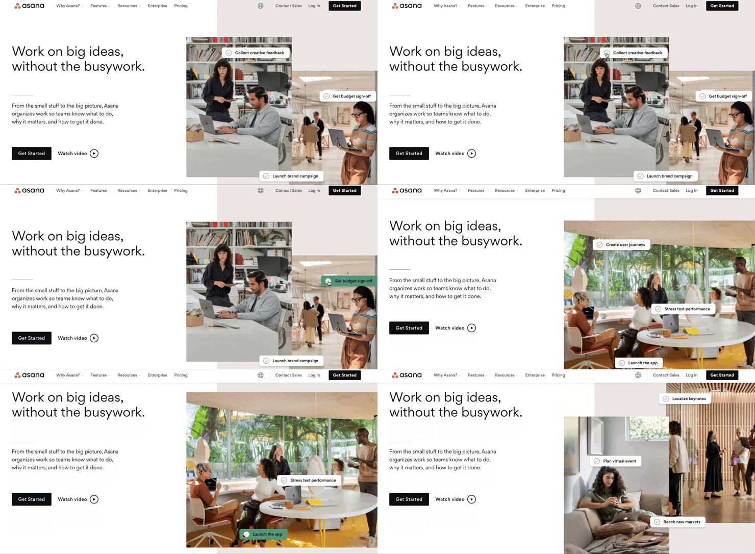
Asana’s is one of the most well-designed sites on this list. Everything about it is eye-catching, including the interactive visuals on just about every page and the contrasting colors that make information pop. CTA placement is on point, and the demo landing page is really well done, clearly showing what you’ll get out of the demo video. But perhaps the most notable aspect of the site is the value proposition right at the top of the homepage. Many B2B websites struggle with this, but Asana nailed it. There’s no question about what Asana delivers and why the prospect will benefit.
15 Harvest
Semrush Stats:
- Authority score: 60
- Estimated monthly organic visits: 435K
- Page one keywords: 819
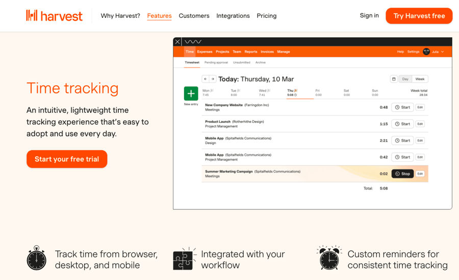
Having employees track the time spent on tasks can be a drag—you know they’re not going to love the idea, and forcing them to use a tool every day can be an obstacle. Harvest makes it incredibly easy for employees to time track, and their website makes the decision for businesses to use their tool even easier. You’ll find clear and to-the-point information, easy to understand pricing, and a standout features page, which clearly highlights where Harvest shines.
How much could your company grow with growth content?
Calculate your expected growth in organic visits based on the average Nectafy client.
Get all these numbers in your inbox.
Which B2B websites do you think are the best?
Obviously this is a very small sampling of some of the best B2B website designs out there, so we’d love to hear from you. Let us know what site stands out to you and why, and we’ll be sure to add it to our list!
And if you need help making your company’s B2B website shine with the right content, let us know!

