9 Guidelines For Skyrocketing Your Web Content's Readability


by Tiffany Nix • 6 minute read • January 22, 2014

Have you ever wondered if anyone is actually reading the stuff you write? Well, here's a giant blow to your ego (and mine)—they're not. But don't give up yet! It's not as bad as it sounds. They're not reading your text word for word—instead, they're skimming through it. That's just how people “read” on the web.
So, how do you make sure those “skimmers” get the most of what you’ve written? It's simple—just make sure your website content is as easy as possible to consume. Here are some specific web content readability guidelines to help you out.
The Actual Content
If you've done any research on this subject before, you may have come across this outstanding study by Jakob Nielsen. In it, he gives us the actual example text he used in his comparison study to show how much certain changes improved readability.
So, let's start with his "control condition"—this is the original "promotional" paragraph he started with. As he describes it, it's "the 'marketese' found on many commercial websites."
Nebraska is filled with internationally recognized attractions that draw large crowds of people every year, without fail. In 1996, some of the most popular places were Fort Robinson State Park (355,000 visitors), Scotts Bluff National Monument (132,166), Arbor Lodge State Historical Park & Museum (100,000), Carhenge (86,598), Stuhr Museum of the Prairie Pioneer (60,002), and Buffalo Bill Ranch State Historical Park (28,446).
(Yeah, you didn't even read that, huh?)
1. Get to the point—make it concise.
One of the best ways to improve your website’s “usability” is to shorten things up! If people are scanning, then you might as well cut the unnecessary details. Take a look at how they changed up their promotional paragraph and made it more concise:
In 1996, six of the best-attended attractions in Nebraska were Fort Robinson State Park, Scotts Bluff National Monument, Arbor Lodge State Historical Park & Museum, Carhenge, Stuhr Museum of the Prairie Pioneer, and Buffalo Bill Ranch State Historical Park.
They combined only the necessary details from the first two sentences and eliminated the visitor count—because of that, the word count was cut in half.
This improved readability by 58%, which is pretty impressive.
2. Keep your reader on track by using objective language.
If you refer back to that original promotional paragraph, you’ll notice that it starts out with a pretty strong statement about Nebraska’s “internationally recognized attractions.”
My husband is from Nebraska, so I’m not going to start dissing his home state—but, some people may read that first sentence and think, “Yeah, I’m sure Nebraska has some amazing attractions.” (Read with sarcasm.)
Eliminate any opportunity to send your reader off-track—use “neutral rather than subjective, boastful, or exaggerated language.” Check out how they changed the paragraph:
Nebraska has several attractions. In 1996, some of the most-visited places were Fort Robinson State Park (355,000 visitors), Scotts Bluff National Monument (132,166), Arbor Lodge State Historical Park & Museum (100,000), Carhenge (86,598), Stuhr Museum of the Prairie Pioneer (60,002), and Buffalo Bill Ranch State Historical Park (28,446).
This small change improved readability by 27%!
3. Format your text to make it scannable.
Any large chunk of plain text is difficult to read. You can help eliminate some boredom for your reader by doing things to naturally draw their eye to important phrases or the next piece of information.
In the control paragraph in Nielsen’s study, Nebraska attractions are listed within sentence form. By simply breaking that sentence out into a bulleted list (without any other changes), readability improved by 57%!
Nebraska is filled with internationally recognized attractions that draw large crowds of people every year, without fail. In 1996, some of the most popular places were:
• Fort Robinson State Park (355,000 visitors)
• Scotts Bluff National Monument (132,166)
• Arbor Lodge State Historical Park & Museum (100,000)
• Carhenge (86,598)
• Stuhr Museum of the Prairie Pioneer (60,002)
• Buffalo Bill Ranch State Historical Park (28,446).
Here are some other ideas about how to format your text so that it’s easy to read.
- Bold significant keywords and phrases
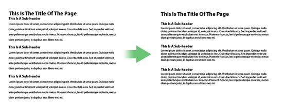
- Outline your article for the reader by using heading tags and sub-titles
- When possible, use bulleted lists instead of written-out phrases
- Use shorter paragraphs than you would in conventional writing (keep it to one idea per paragraph)
4. Combine all of those powerful ideas for the ultimate readability.
When Nielsen combined all those tactics in his study, he came up with this paragraph:
In 1996, six of the most-visited places in Nebraska were:
• Fort Robinson State Park
• Scotts Bluff National Monument
• Arbor Lodge State Historical Park & Museum
• Carhenge
• Stuhr Museum of the Prairie Pioneer
• Buffalo Bill Ranch State Historical Park
And making all those changes increased readability by 124%.
124%! Pretty amazing. It’s definitely worth the time it would take to go through all your existing web copy and make those changes.
How The Content Appears On Your Website
Along with your actual web copy, there are some things you can do just to the appearance of your text to make it easier for your website visitors to read.
1. Choose an appropriate, easy-to-read font.
“Novelty” fonts are okay for titles (because they’re short), but paragraph text should always be in a standard font. Sabina Idler says:
“You should use clear sans-serif fonts. While serifs help the readability in printed media, because they support the reading flow, it does just the opposite on the Web. On screen, the little serifs easily blur together, making it more difficult to read the text.”
Arial and Helvetica are always good choices.
2. Make sure your text stands out completely from its background.
Choose a high contrast between your text and background colors. When there’s low contrast (or “conflicting” colors), it becomes difficult read.
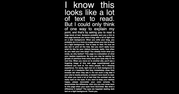
And, while light-colored text on a dark background is definitely a contrast, you should tend to stick to the reverse—use dark text on a light background. It’s easier on the eyes.
Don’t believe me?
Someone created this cute little web page called, “Ow, My Eyes!” specifically to make that point. Click the screenshot below and visit the site to get the whole experience. (Really, you’ll start to get a headache.)
3. Your font size should be at least 16px.
Think about your own experiences with websites. Isn’t it frustrating when the copy is too small? And while your browser does have a zoom feature, it’s definitely not ideal to have to use it.
The proven font size to go with is 16 pixels. Not too big, not too small. (If you want to read more, check out 16 Pixels For Body Copy. Anything Else Is A Costly Mistake.)
4. Line spacing should be around 150% of the size of the font.
That means, if your text is at 16 pixels, your line spacing should be around 24 pixels. (Check out the spacing we have on this page—that’s the guideline we’ve followed throughout our whole site.) Using less space can make your lines run together.
There is also such a thing as too much space. You’ll want to make sure that you can easily see space between your paragraphs.
Paragraphs naturally break up the text into shorter segments—which makes the copy easier to read—so, keep that in mind as you experiment with line spacing.
5. Keep your copy’s line lengths to 50-60 characters.
See how our blog text doesn’t extend across the entire page? (There’s a sidebar to the right.) That’s actually intentional! Longer line lengths make it difficult to jump from the end of one line to the beginning of the next line. Keeping your line lengths to around 50-60 characters helps the website visitor stay in their natural reading (skimming) “groove.”
Depending on your current content and its appearance, just making these simple changes could increase your website’s readability and usability by over 100%! (Maybe even by multiple-hundreds!) That’s some exciting news. And definitely worth the time and effort. Can you think of anything that I left out? Let me know in a comment below.


