The Secret Behind Landing Page Conversion Rate


“Is my landing page performing well?”
Ever wondered that? Yeah, you have, and so have we. Maybe you’re reading this article to find a single, simple way to answer that question. But it’s difficult to benchmark against how others are doing because there's no single way to tell.
This article from Leadpages does a really nice job explaining why it’s tough to answer that question and say what constitutes a good conversion rate. (You should take a couple minutes to read through it; it’s a great article). The gist of it is this: It depends. [Insert meh emoji here.]
“Awesome. Great. So what do I do now?” you may be wondering. “What’s the secret behind landing pages that convert visitors into leads?” At Nectafy, we’ve discovered a basic truth:
The simpler the landing page, the higher the conversion rate.
Marketers (including us sometimes) get so hung up on the idea of how things look that they stop thinking about whether or not they’re actually offering content that’s valuable. (We’ve seen this happen when there are multiple people in a marketing office—instead of saying, “Let’s make this page convert,” people start saying, “Let’s make this look really cool.”)
And that’s where the trouble comes in—when you start focusing more on appearances (in this case, I’m talking about landing page design) and less on the value of submitting the form, you begin to get further away from what your potential customers are looking for.
So what should you do instead? At Nectafy and for our clients, we’ve seen average landing page conversion rates improve by making changes to and creating landing pages based on simplifying and clarifying value. I suggest starting here:
Be more concerned with...
- The value of the actual offer.
- How well you’re conveying that value in your landing page copy.
- Matching the value of the offer to the amount of information you want someone to give you in the form.
Be less concerned with...
How cool the design is. Of course landing page design matters, but it doesn’t outweigh the importance of clearly communicating value.
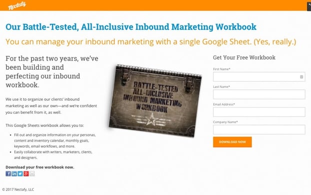
Take a look at one of our website’s top-performing landing pages: our inbound marketing workbook landing page. It has a 45.24% conversion rate and follows the premise that simplicity and clarity are more important than cool design.
How To Test It
Step into your customer’s shoes and ask these questions:
- “What’s the value behind the form I have to fill out?” Have you explained the benefits clearly?
- “Is my contact info worth what I’m getting from this?” Are you asking for too much information for what you’re promising in return?
- “Am I getting sold something here?” If you strip out the pretty stuff, is your offer good enough for someone to submit the form? Especially with internet marketing, people know when they’re being sold to.
Shifting your mindset away from “this looks really cool” to “let’s make this convert” is the secret behind improving your landing page conversion rate. Test it and see—we’d like to hear how it works for you.


