5 Missing Ingredients From Your B2B Website


Video transcript
Lance Cummins, Nectafy Founder:
In my daily work with Nectafy as a salesperson, I'm constantly reviewing business websites, and it’s pretty obvious that there is a wide, wide opinion of what goes into making a good business website. So today I'm going to tell you the things that I think should be on every effective B2B (business to business) website.
#1: A Personal Tone
One of the first things that I think differentiates a mediocre B2B website from a really effective one is the fact that they are actually speaking to me as the reader of that page. So they're using the words like you. When somebody is on your website, the chances are extremely high that your visitor is a single person, usually in a very personal environment. And what a lot of businesses forget is that, when you're talking to that prospect, you're talking just like you would talk to somebody if you had taken them to lunch. So the websites that most consider that approach are the most effective in connecting with the buyer.
See Also: 20 Examples Of Beautifully Strategic SaaS Website Design
#2: Reader-focused Copy
Here's how a lot of B2B websites are created: Someone in the business says we need a new website so we go find some really cool looking websites. And we go, company X has a cool looking website. So we're going to copy that. Somebody contact the sales team–maybe they've got some sales brochures. Let's see. And what I'll do is I'll just copy over the text from the last website. Most likely the copy and the images. Everything is about you. As the company, as a reader, as a person trying to figure out, have I found somebody who can help me manufacture this particular device? You haven't really told me anything. The idea is to take what the person who's looking at the page is trying to figure out and make everything on your website about that person.
#3: Growth Content
Most people who need what you sell don't know you exist. How are you going to talk to the people who have a problem that you can solve that don't know you exist?
You have to talk about things that aren't directly what your company does. You have to talk about problems that you can solve. The only place that really makes sense for that content to live is on a blog. You can consistently create content that says, Oh, you're having a problem doing this. Here's some way that you could solve this and you provide something helpful, right? So that, that person is glad they found it. They look up in the upper left hand corner where your logo is and go wait, who wrote this? They go and click on your product pages and ask, why am I trying to solve this problem myself? I should just contact these guys and talk to them about what they do.
That’s the idea behind what we call growth content here at Nectafy. It typically lives on your blog. But then it overflows into the pages of your website. It lives on landing pages. It lives on your contact forms. That's what growth content is across your website. And every B2B company needs it.
Related:
- What Does B2B Content Strategy Look Like?
- From 600 to 6,000 Organic Visits In 12 Months: The B2B Blog Strategy
#4: Engagement CTAs
If you really want to separate the contenders from the pretenders with B2B websites, there is one really simple way to find out. Go to their website and find the way to start a business relationship with them.
This is what the pretenders do: You're going to see a contact us button. And when you click on contact us, there's going to be a very, very boring form. And it's just going to say name message and email or phone number. That's a sign that that company does not need new business. They're basically saying you have to start a conversation from scratch and we'll go forward from there.
So what should you do instead? Think about what is the main thing you want a prospect to do when they're ready to engage with your company. Maybe in your case, it's a demo. Maybe you have some really complicated software and you really want them just to see the software. Maybe it's a quote request. Maybe it's a request just to talk to a salesperson to get further insight. So you create a page for that, which explains what you're trying to do. Here's what we want to show you. Here's what you can expect. Grab a time on our salesperson's calendar and book that demo right now. Those are the companies that care about initiating the sales process.
See Also: 30 B2B Lead Generation Landing Page Examples
#5: A [Real] Team Page
If you do any thinking at all about what makes your business different from every other business online, especially the other businesses within your industry, there is one particular thing that differentiates you. Most businesses completely miss this opportunity: It's your people.
Your people are what make your business different. Maybe you think you have a fantastic product. Maybe you think you've got some revolutionary innovation, but I guarantee you, the reason your customers continue to do business with you is because of the people they interact with at your company.
Here's what's messed up with most B2B websites. There's a page that says about us and it might list the leadership guys in their suits and ties. Meanwhile, all the people that actually interact with your customers are nowhere to be found on that page. You've got to make it clear that your people are the differentiators.
There are some companies who do this really, really well. They've got pictures of their real support people. And when you call support, guess who you're talking to? It's that person. That's genius. Because what you're doing is you're building a bridge between your customers or potential customers and the real people that they're interacting with, and you create trust. Now, if you're a manufacturing business and you've got 4,000 employees, I get it—that may not be possible. How about a group picture? By skipping that on your website, you're doing your company a tremendous disservice, and you're missing a chance to really differentiate yourself.
In Short: It’s Not All About You!
Everything about your website should be built and designed with your customer in mind. In other words, build it from the outside in and not from the inside out. Your content, how your customer contacts you, how your customer gets to meet your people, how you speak about starting a relationship—all these things are customer-centric, not company-centric. Apply that and your website will stand out in the B2B world.
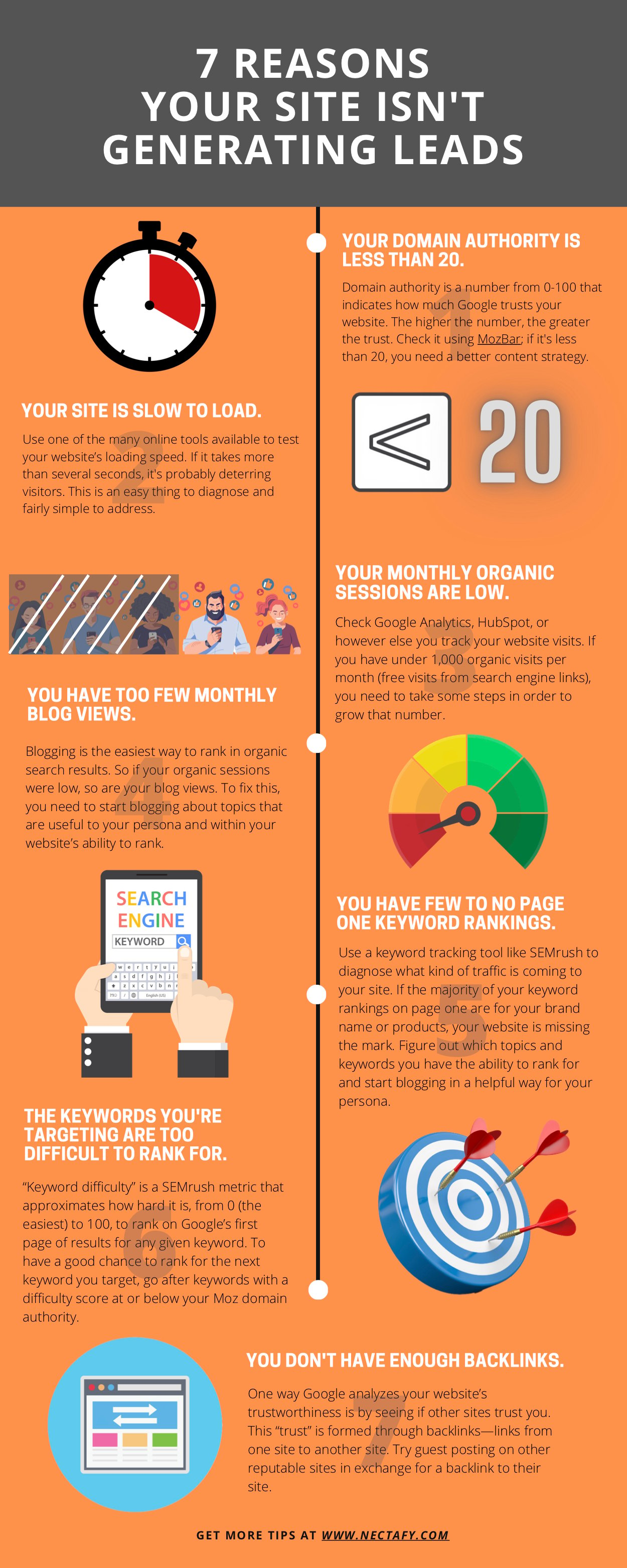
Is your website generating leads?
Take a look at these seven key metrics to find out if your B2B website is able to generate leads.

If you find this article useful and want to start growth content for your company, there are two ways to go:
- Read this—How To Generate Meaningful Organic Traffic To Your Website In 90 Days - to get all the highest impact strategies started in the first three months.
- Or, talk to Lance about your goals. He can point you in the right direction.

